App Home View
How to improve the UX/UI of the study application’s home view and provide it for two different business models?
Mafy Oy
A Finnish online study material provider and has two different products:
Mafynetti
For university entrance exam preparation and high school courses in Finland
A successful study platform in Finland for years.
Online courses and in-person courses at Mafy’s office building
Happi
A new SAT exam preparation platform for the U.S.
New in the market
Build on top of the old Mafynetti platform
Fully online
Brief
Mafynetti had been a popular study application for years in Finland. Anyhow, they started to face a challenge because the company had never had a designer before and the UI started to suffer from significant UI/UX debt. This wasn’t as crucial in Finland because they had a good reputation and teachers helped in the classroom.
When the company expanded into the U.S. market with Happi, the new SAT preparation product was built on top of the existing platform. As a result, Happi inherited the same UI, layouts, and interaction patterns as Mafynetti, even though it targeted a different audience, brand, and business model.
The UX/UI issues became a critical business challenge. Users needed to choose Happi over competing products, understand how it worked without guidance, and become motivated to continue using it from the very first interaction.
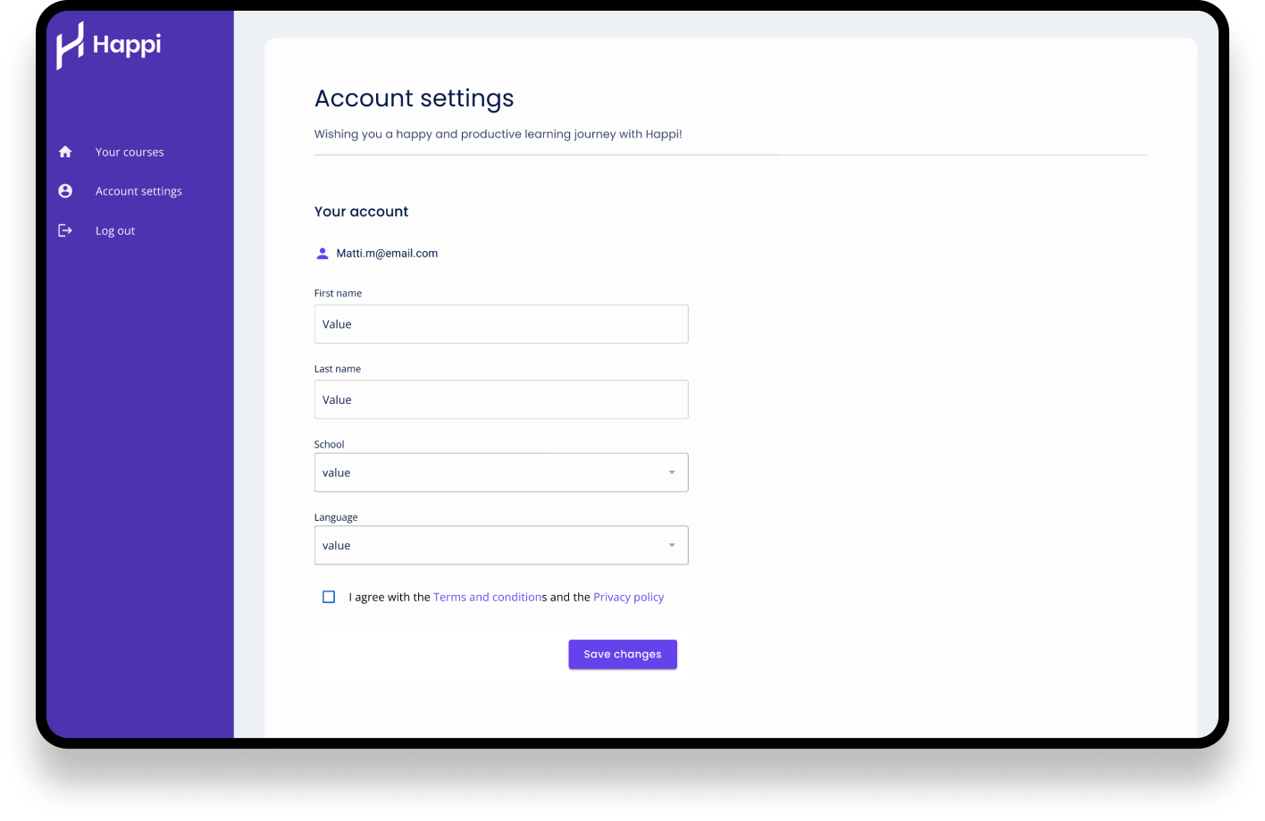
My task was to address the UX/UI issues on the authentication page and the home view, and later, streamline the entire study experience. In this case study I’ll mostly concentrate on the Home View.
Pain points With The Old Homeview
Challenge 1: How to help users find relevant courses more easily?
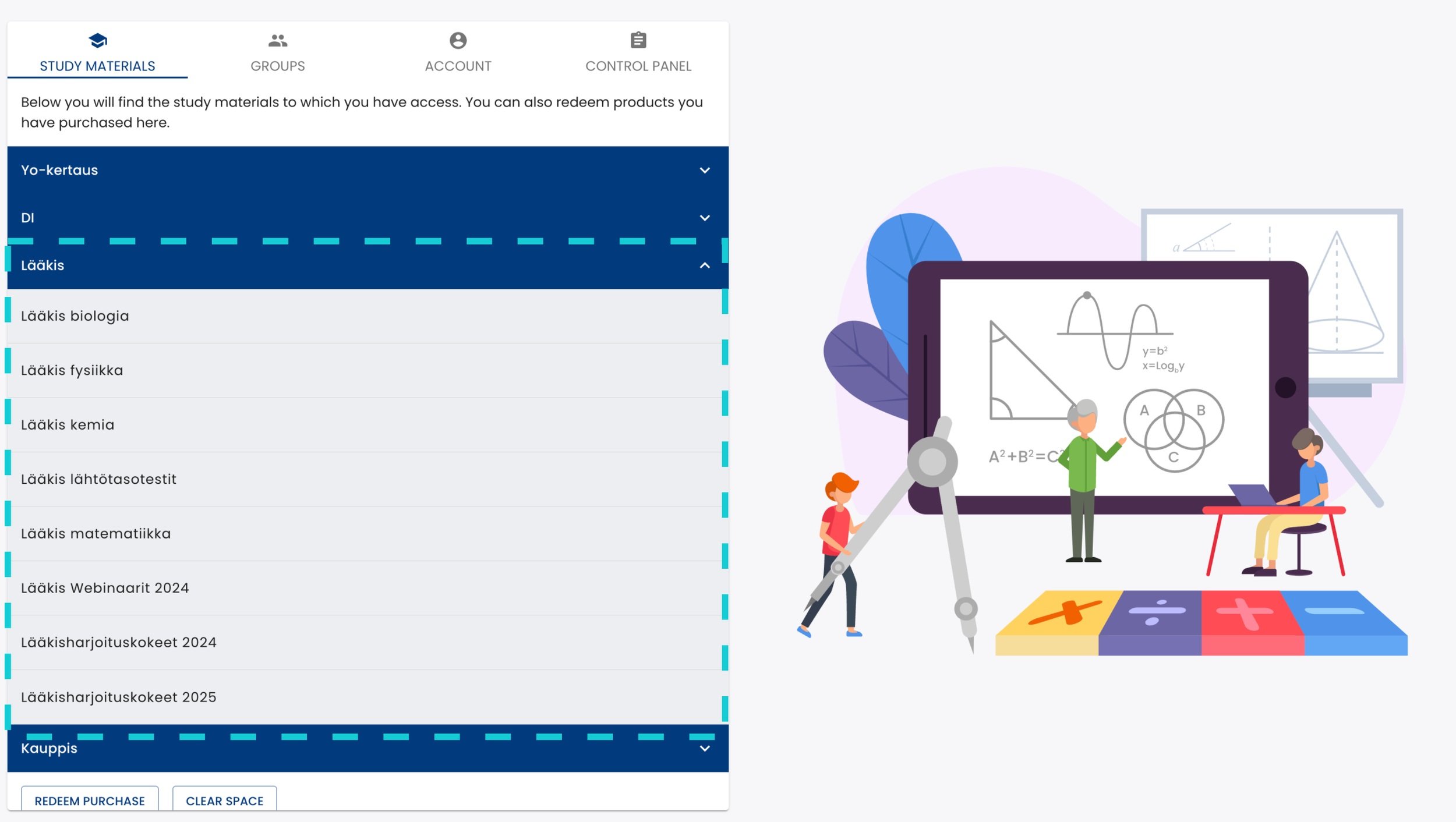
Previously, Mafynetti displayed purchased courses, free samples, and support resources in a single list. Because all items looked the same, users struggled to distinguish between content types and identify what was most relevant. In addition, the large image on the left occupied valuable screen space that could have been used for the primary content.
The Challenge 2: How to make it easier to add a new course?
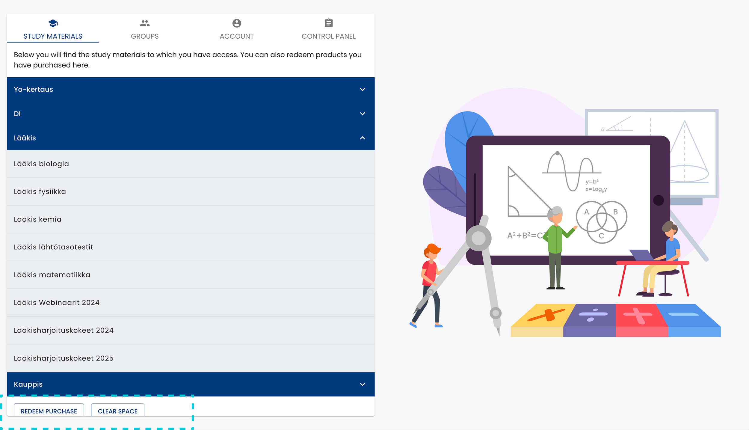
Users needed to add a purchased course by themselves to the home view. This was confusing because the free materials were always displayed on the same list and they looked exactly the same as the purchased ones.
The main issue was to realise where to redeem a new course because it was displayed under the list view. It was very hidden to be one of the main actions. Also, if there were many courses open the button disappeared from the UI.
The Challenge 3: How to make the courses look purchasable for Happi?
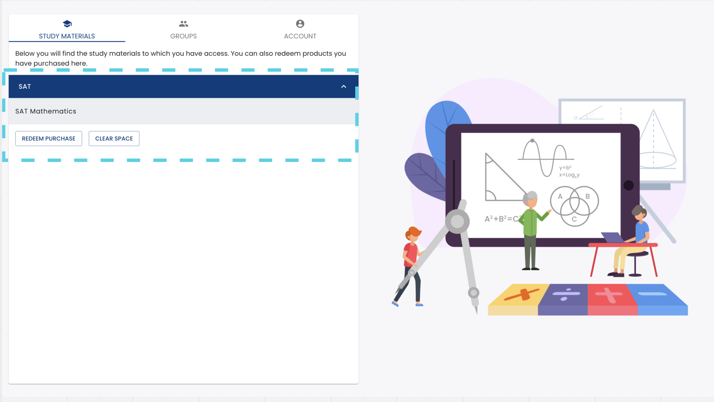
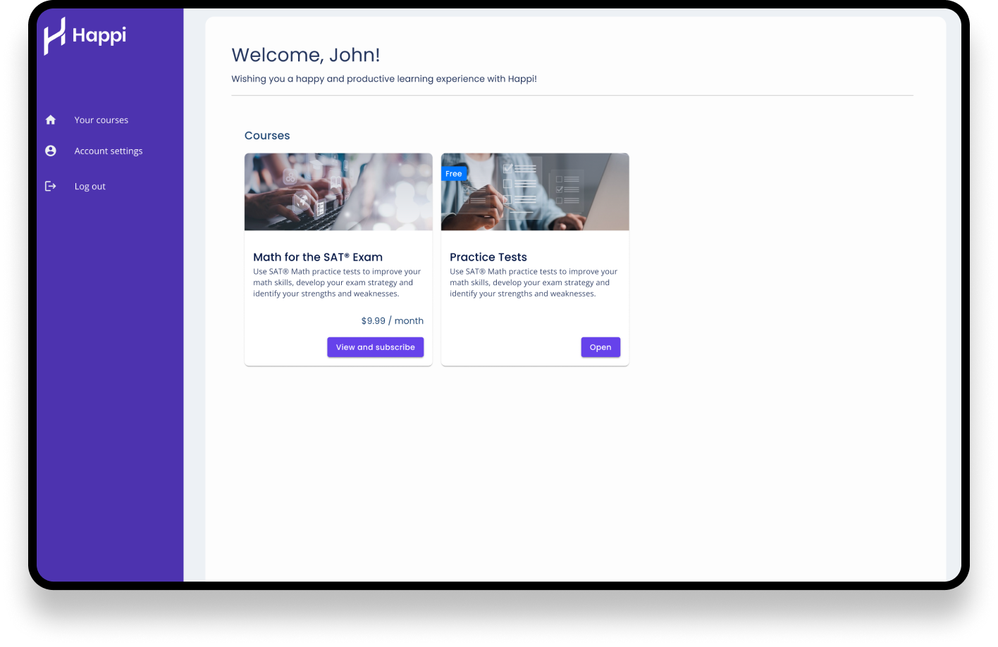
Happi faced a different challenge. With only one SAT Math course, the content felt lost in the large white space, and a collapsible UI didn’t make sense for a single course. The idea was just to add one or two more courses sometime soon.
The other issue was, that we needed to build the purchase flow inside the app. Since purchases happened within the app, the small list item at the top didn’t effectively present the course as a product worth buying.
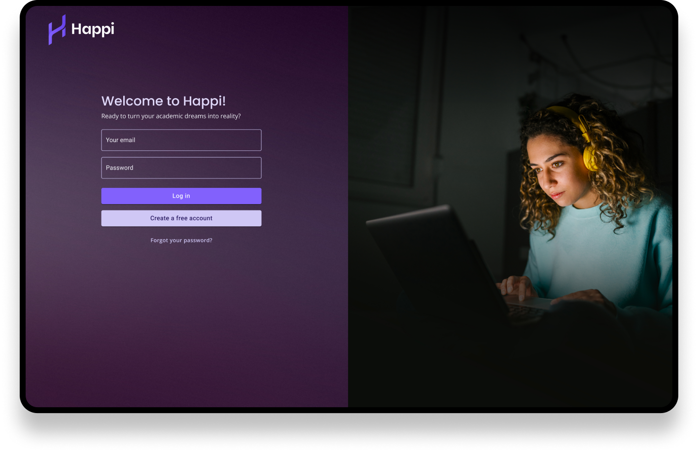
In addition, the UI required redesigning so that it would look and feel like a brand new product, Happi.
The Challenge 4: Inconsistent UI
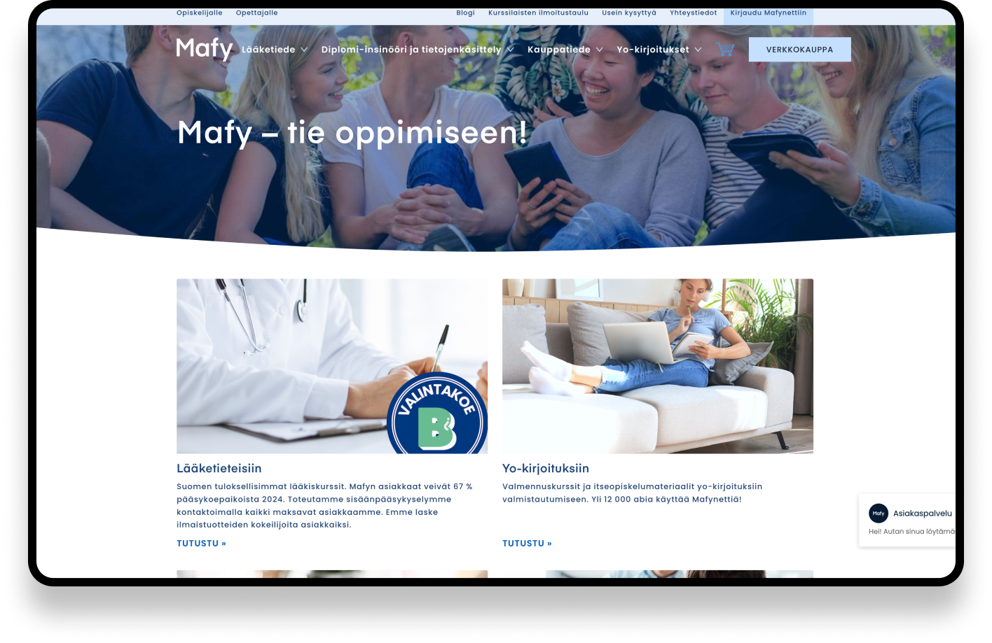
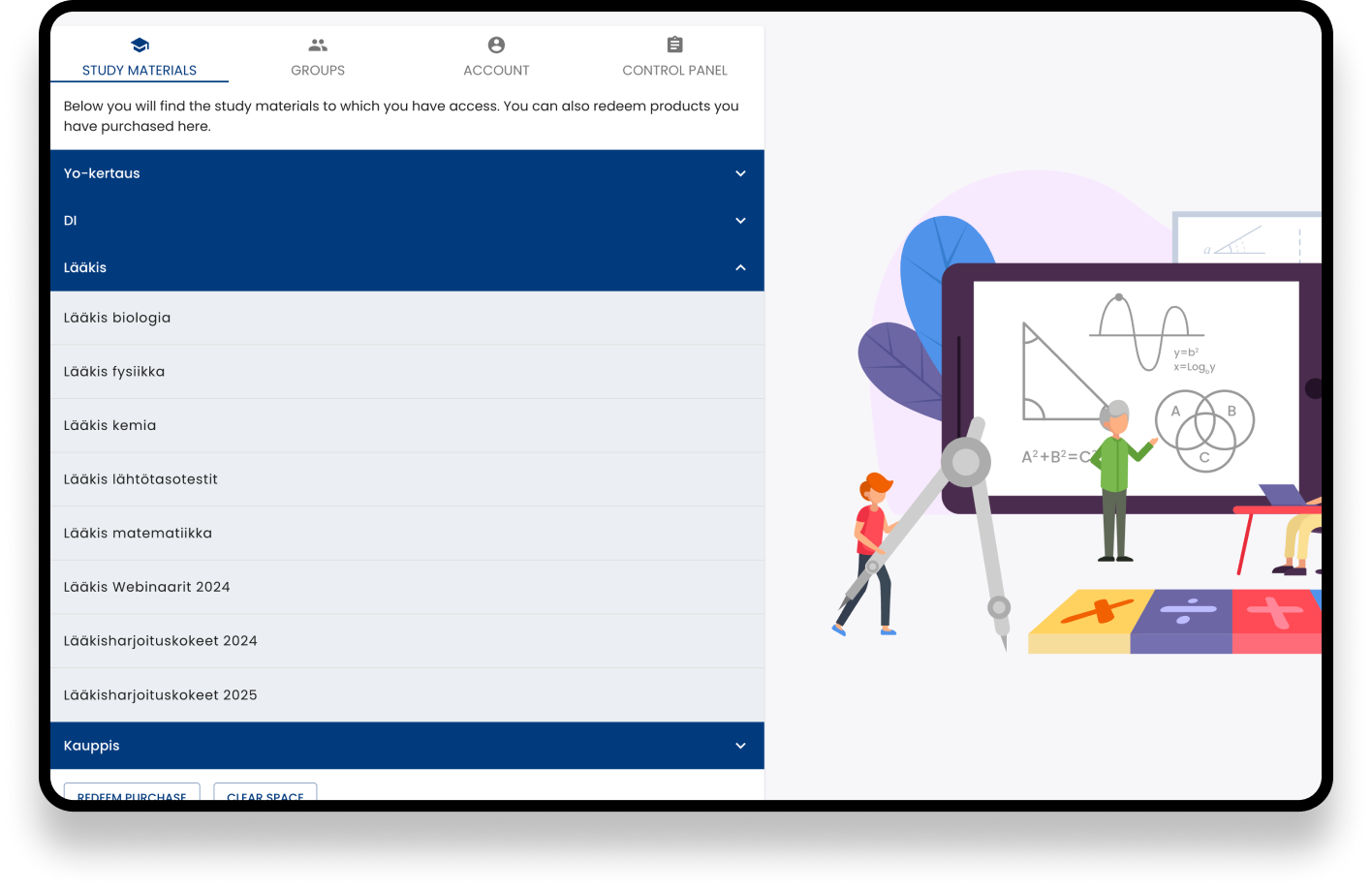
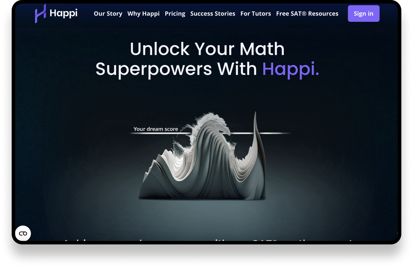

The marketing websites for both Mafynetti and Happi had been designed by external design agencies, but neither application followed the same brand guidelines. As Mafy had never had an in-house designer, the products had accumulated significant UI debt over time.
As a result, the user experience felt fragmented. Transitioning from the marketing website to the application felt like entering a completely different product, breaking the continuity of the user journey and weakening the overall brand experience.
Product Differences and Shared Solutions
The biggest difference between the products was their purchasing model. Mafynetti users purchased courses on the website and redeemed them in the app, while Happi users purchased courses directly within the app. In addition, several other product-specific requirements had to be considered when designing the solution.
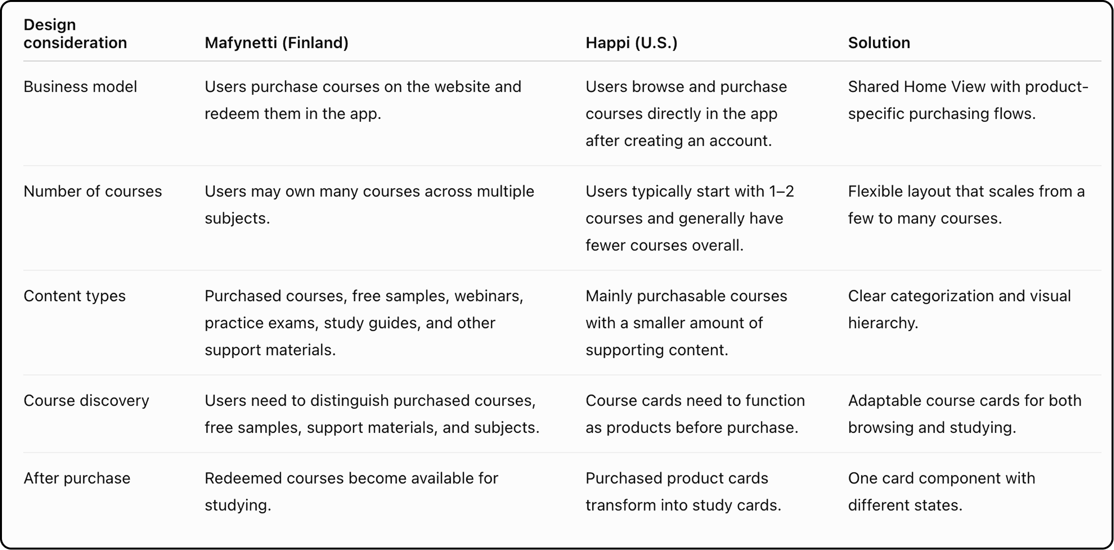
The table above highlights the different business and UX requirements that the shared Home View needed to support.
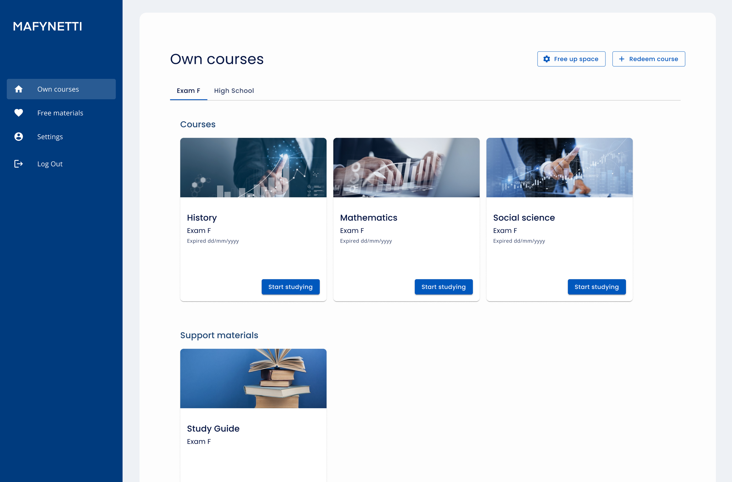
Solution: Individual course cards
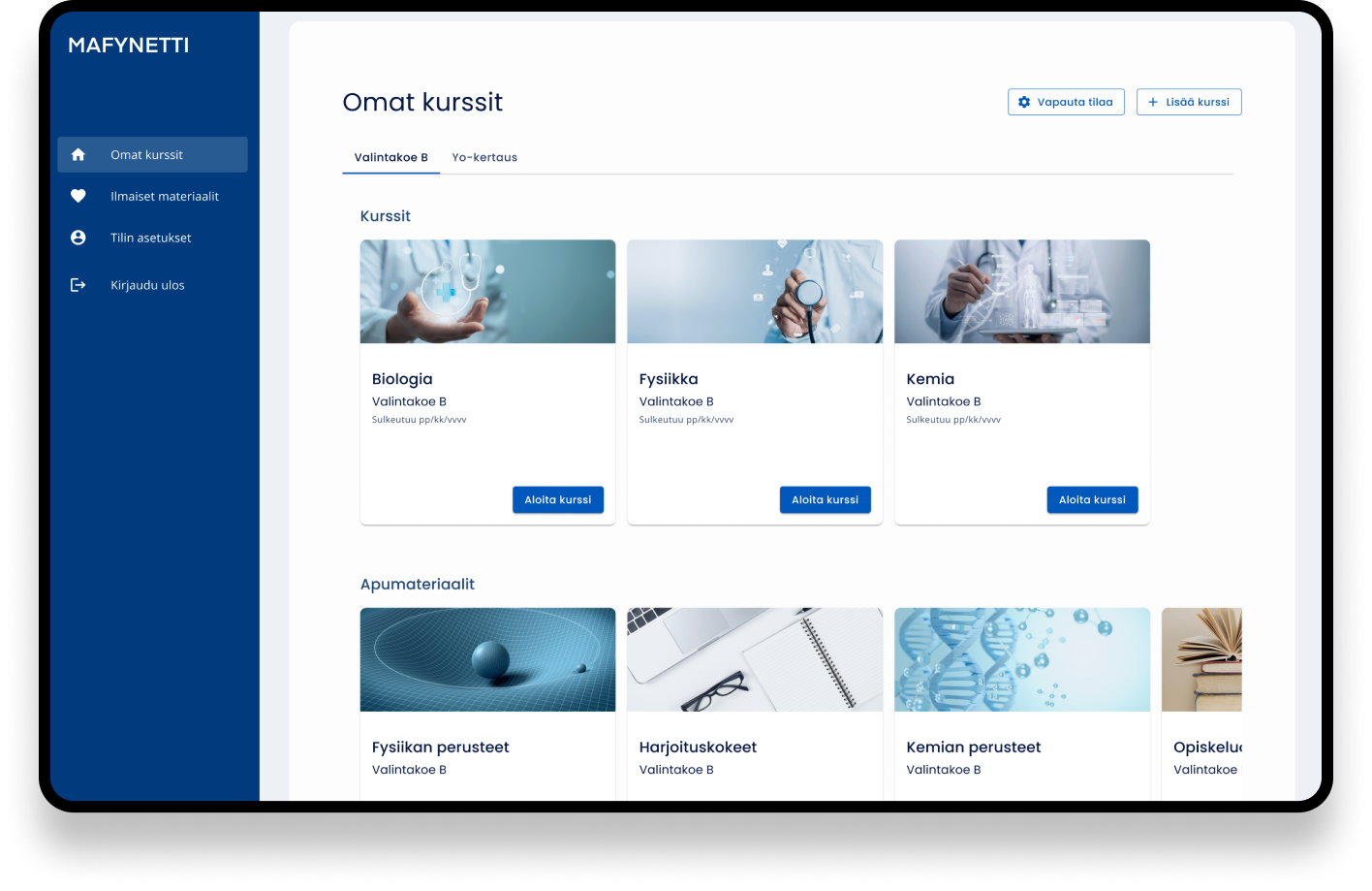
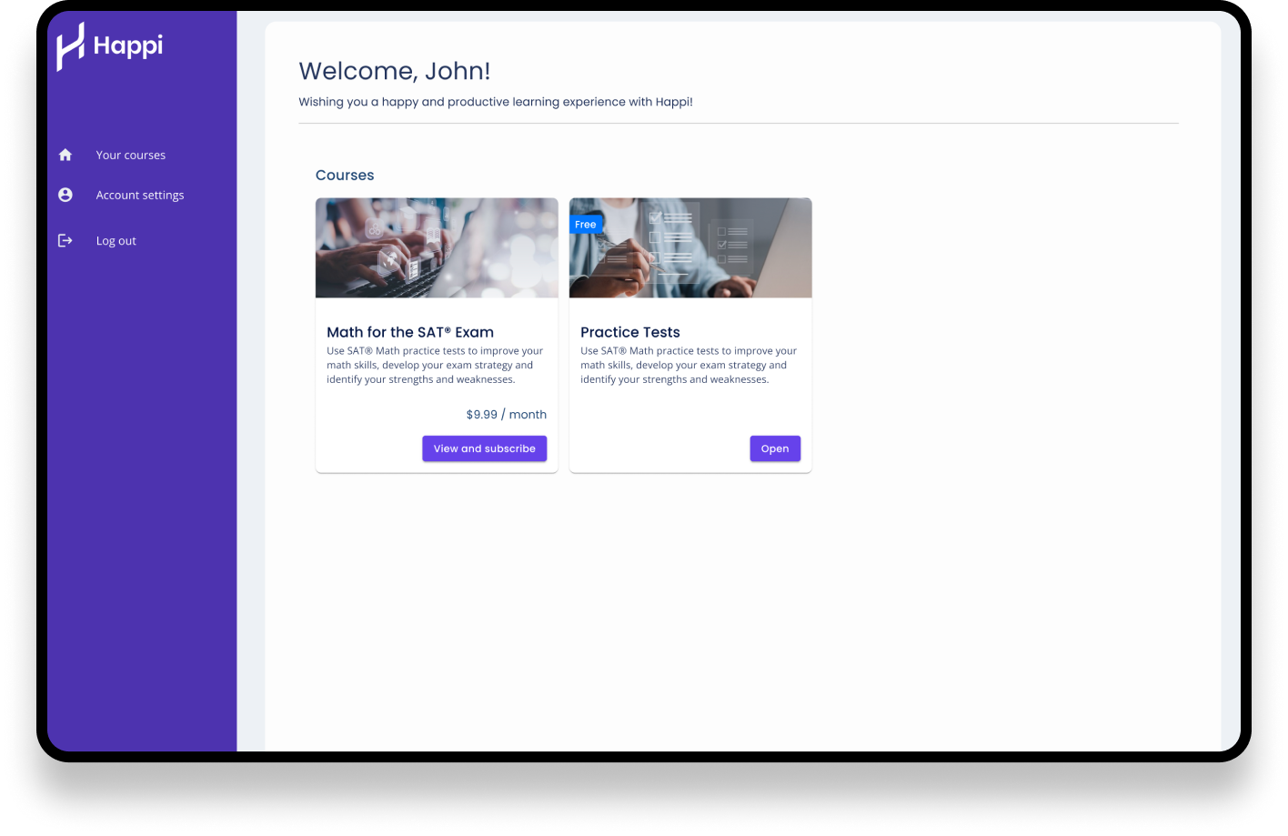
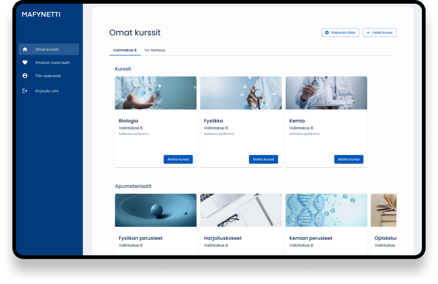
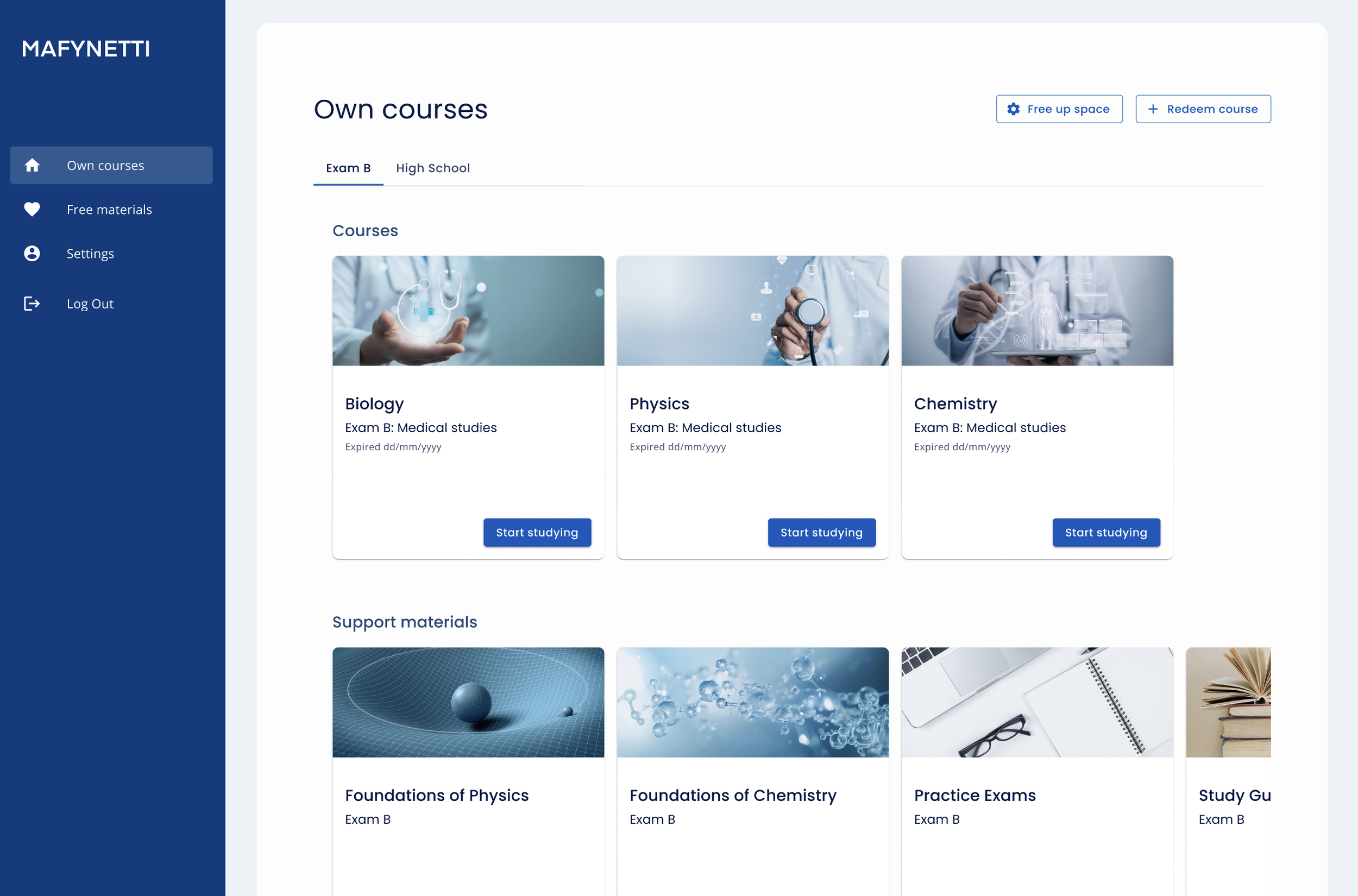
To make navigation between courses and support materials easier, I replaced the course list with individual course cards. The cards use images to help users quickly identify different courses and worked well for both business models: Mafynetti, where courses are purchased through an online store, and Happi, where users purchase courses directly within the app.
In addition ,the user journey felt seamless from the website to the application because the images and colors were following the same brand guide the websites had.
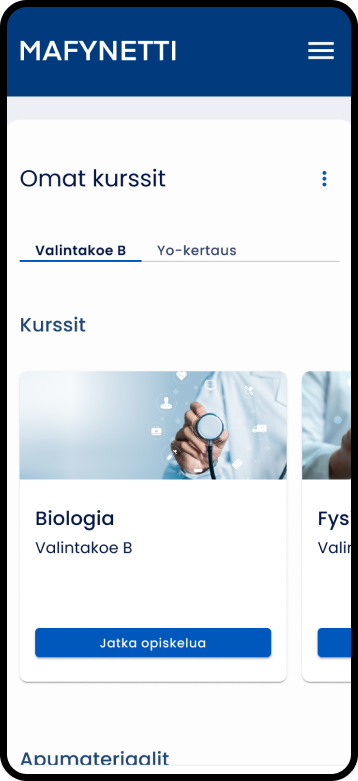
Course cards and categories help to navigate
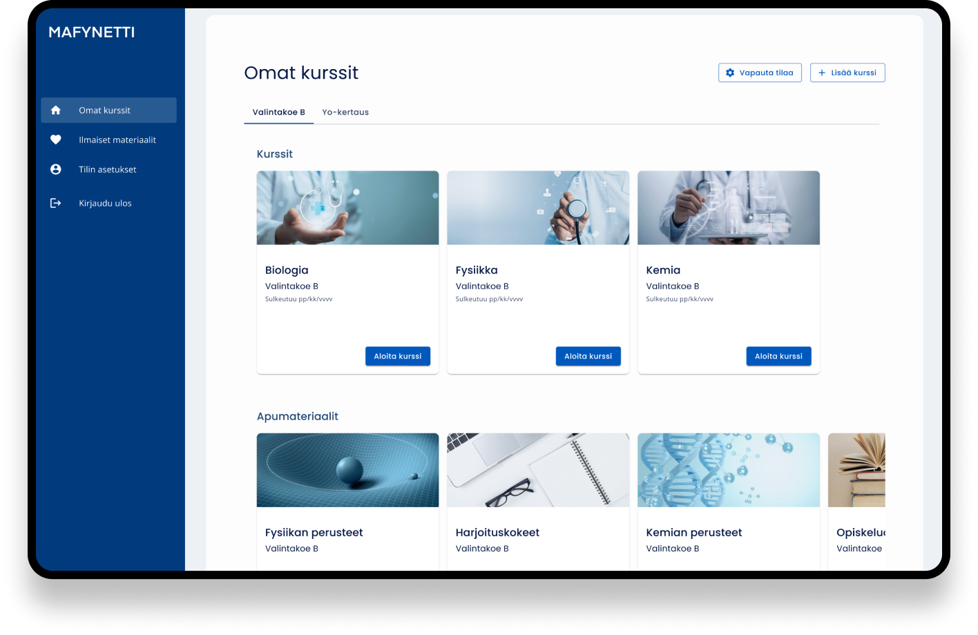
We build an image library for different courses and study materials. Images on the cards helps to recognise different subjects
The cards made the individual courses to stand out more
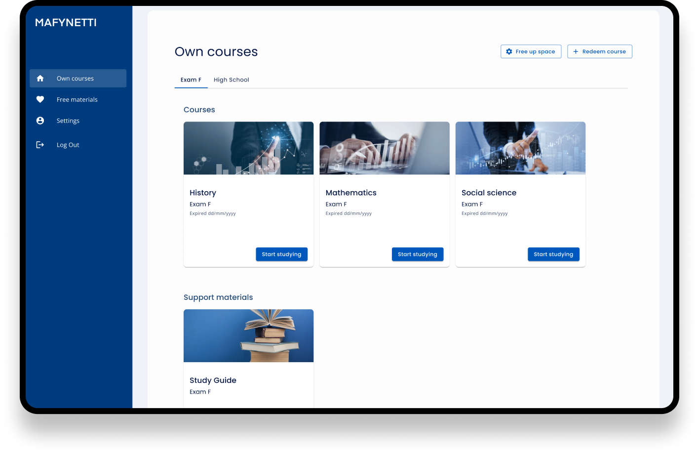
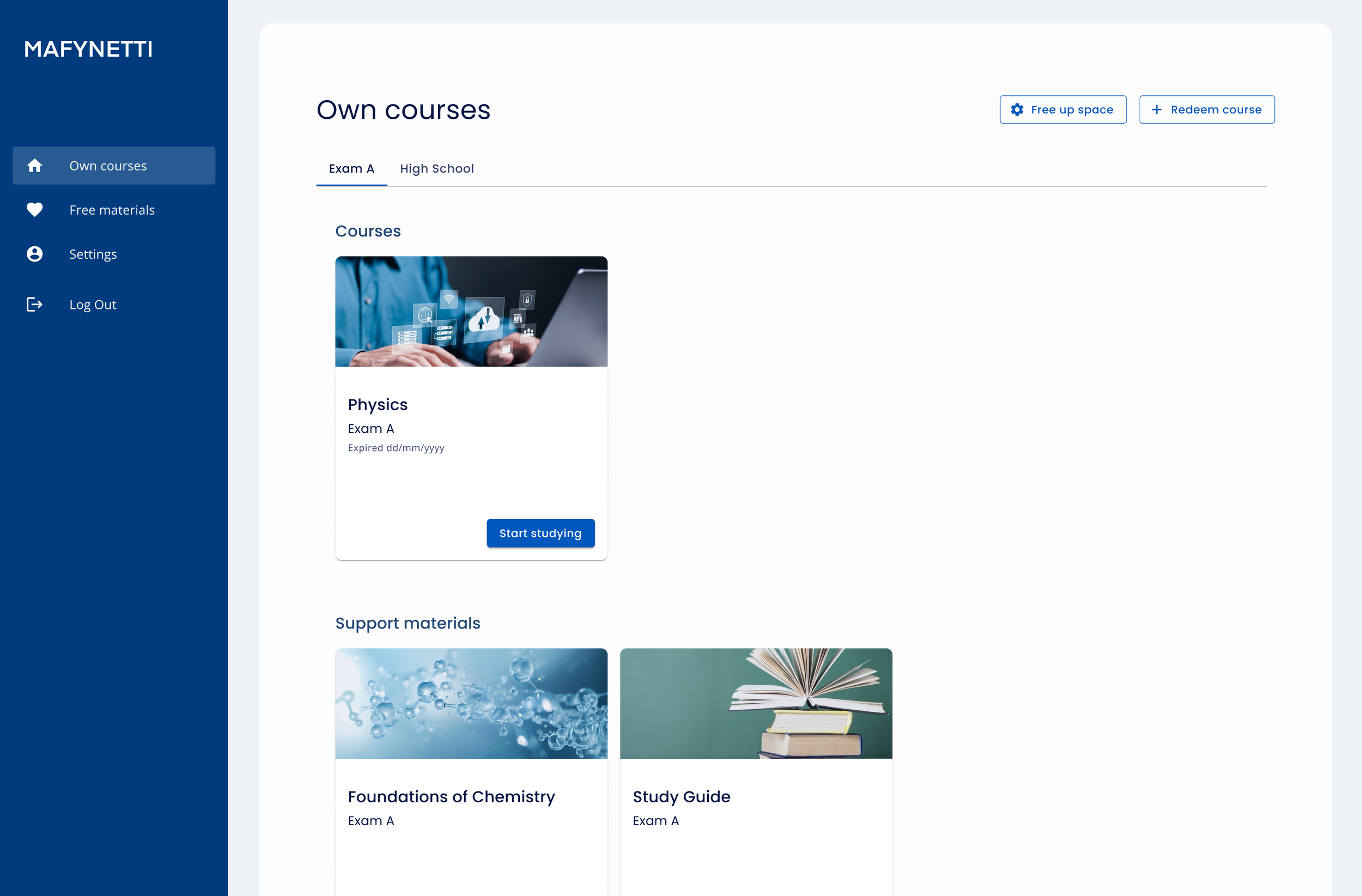
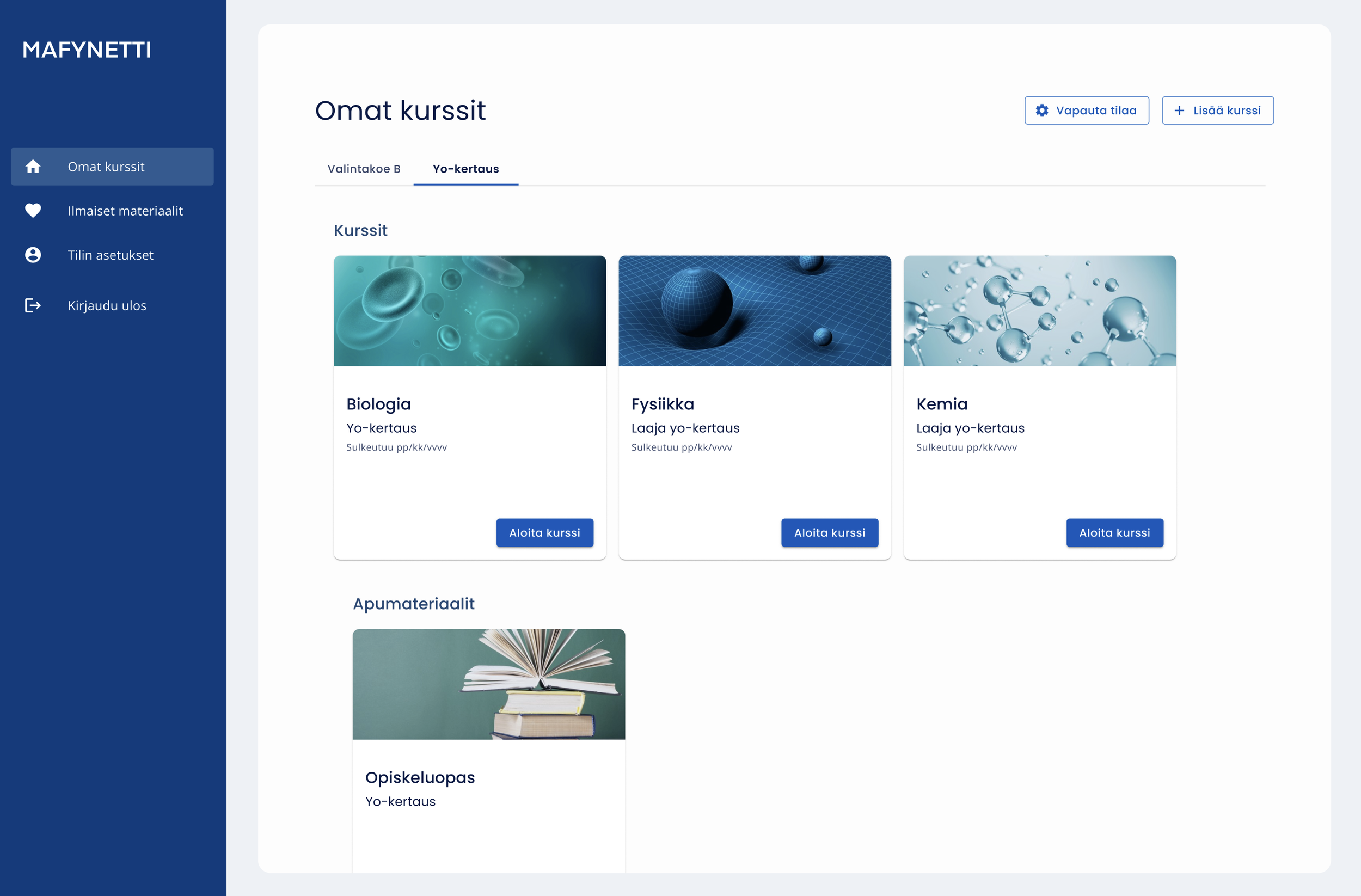
The main purchased courses were on the landing view, categorised under the tabs
The main courses and supportive study materials were separated under different headers to distinguish them better
Free sample materials were on a separate page so users didn’t confuse them with the purchased ones
The seamless experience from the website to home view continued
Subject-specific imagery builds an idea of the course and helps to navigate
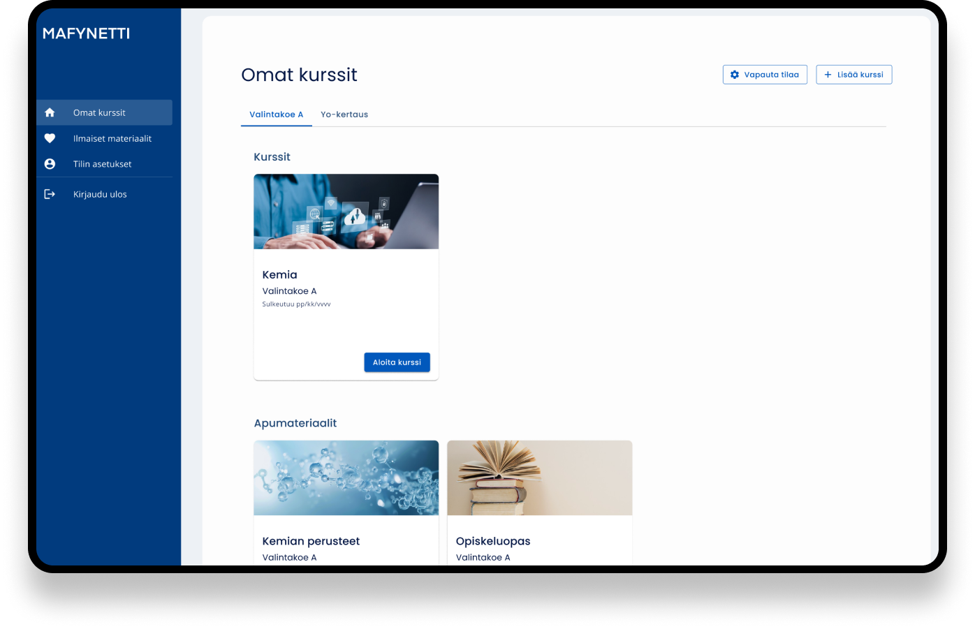
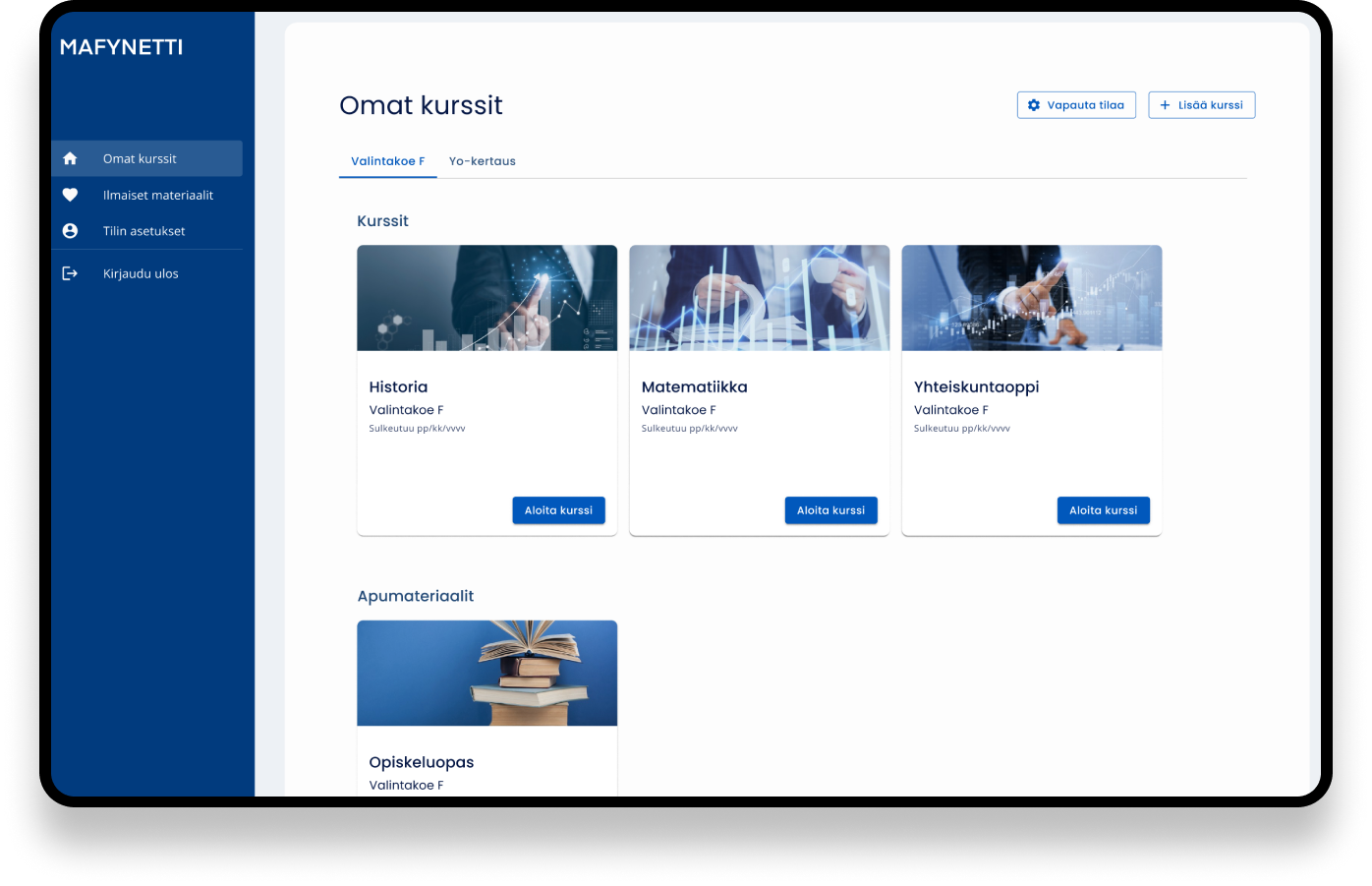
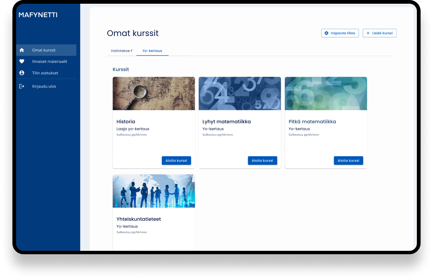
Visual cues help users identify course subjects without relying solely on text. I built a image library where teacher were able to choose images.
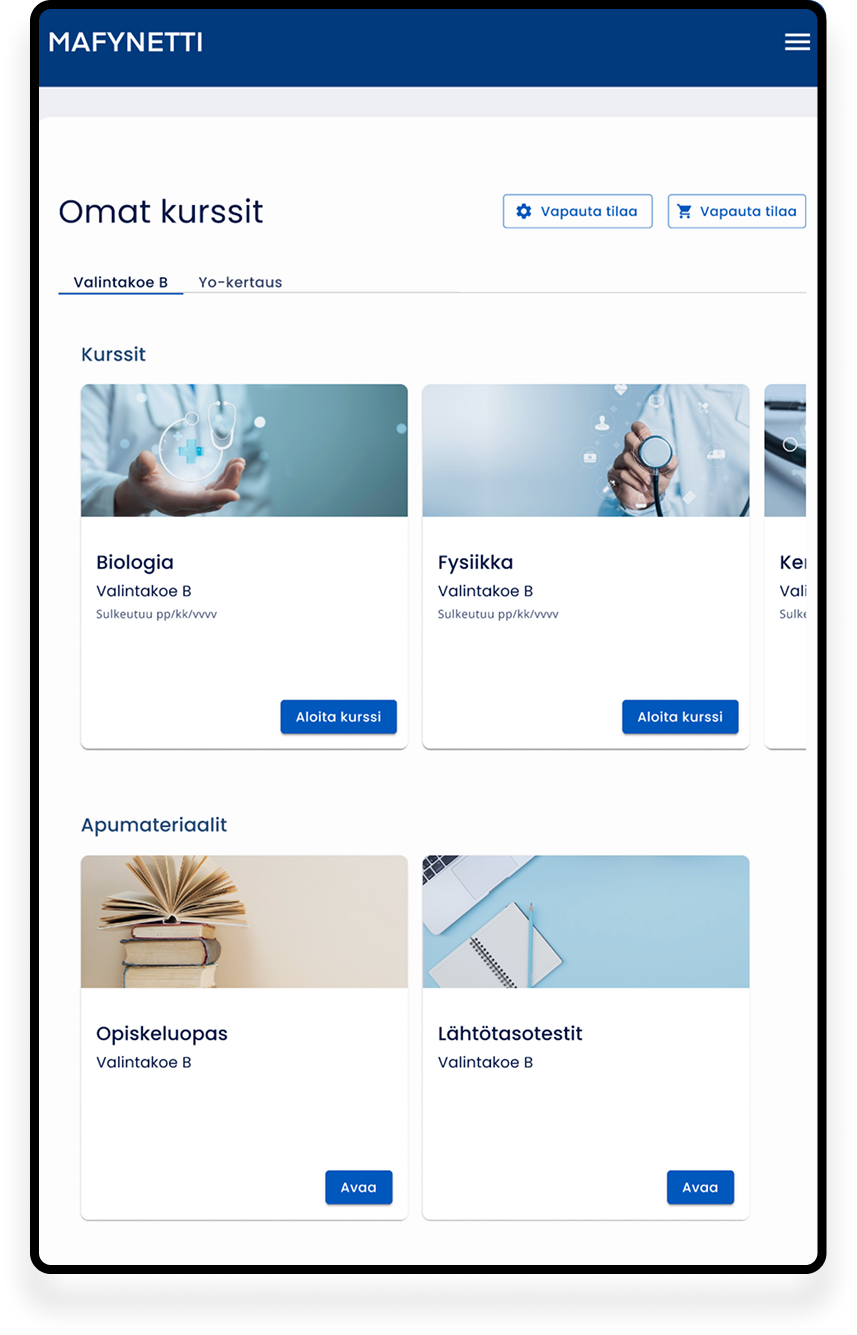
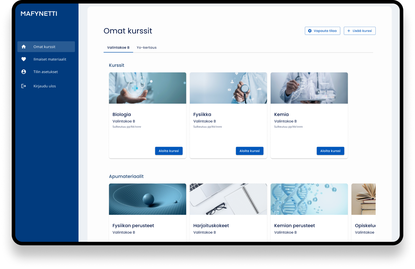
I also introduced categories to make navigation easier. Mafynetti offers university entrance exam preparation packages for medicine, engineering, and business, as well as individual high school courses. Organizing these into separate category tabs made it easier for users to find relevant content, especially if they had purchased multiple courses.
In each tab, the materials under the tab are organized under the headings Courses and Support Materials, making it easier to distinguish between learning content and additional resources.
The improved flow made it easier to add a course
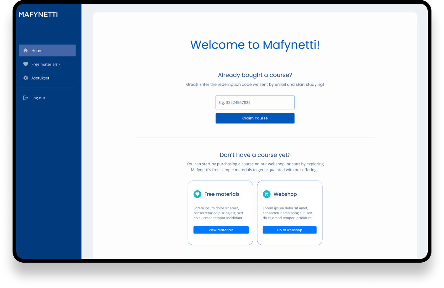
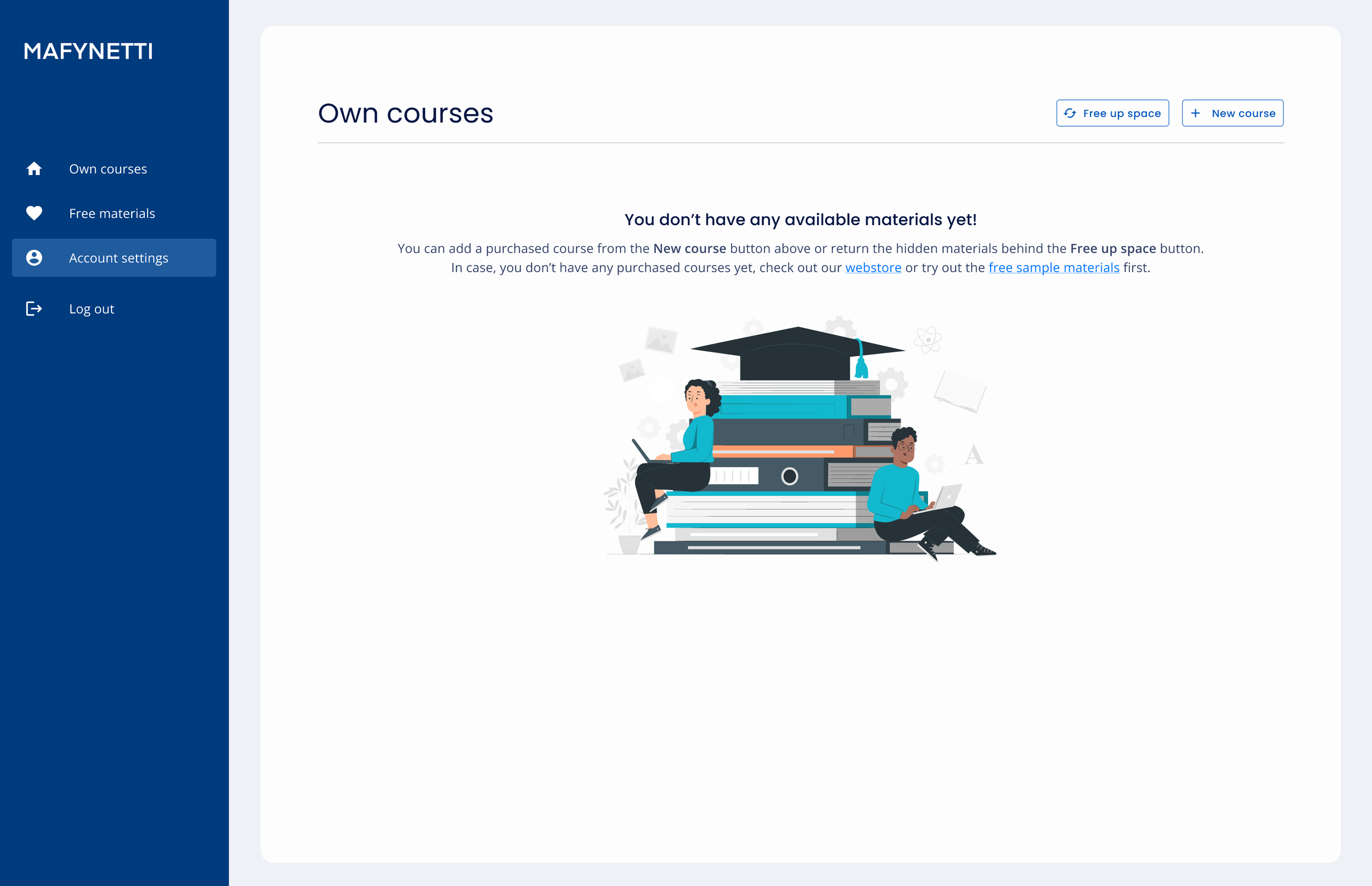
We created a new view to the user flow.
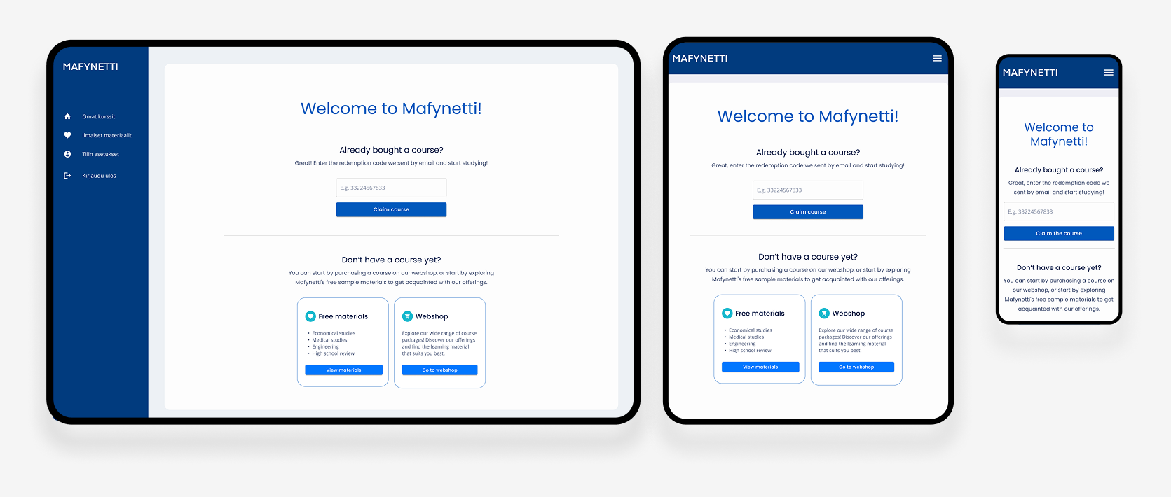
After user had logged in, we showed a page where the user adds the redemption code if we don’t detect the user has a redeemed course already
The field is autofilled if they land from the email link where the code is given
With this solution, the step of adding the redemption code is more visible and we don’t expect the user to understand to find the button to do it by themselves
After one course was redeemed, the user could add another one from the button top right corner
The action was displayed on a visible spot and now the button didn’t disappear under the multiple courses like it used to
Even if our users mainly had a laptop to study, we naturally designed it for a tablet and phone as well.
The Purchase Flow in Happi
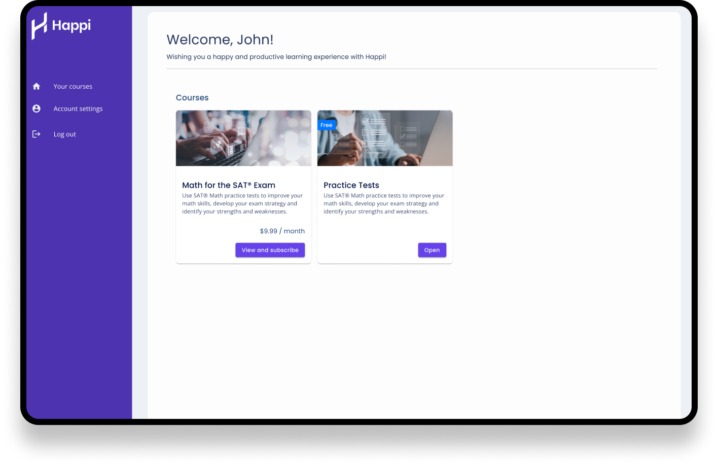
The user flow was different in Happi where the product needs to be purchased in the app.
The cards worked as product cards, and after purchasing, they became normal course cards.
The UI had space and flexibility to the new experiments the stakeholders wanted to

Approved by users
We tested the new flow and the new UI with 5 students at the office building where they studied for the entrance exams. We got real target users because they were currently using the old application and studying for the university entrance exams.
The test results were great:
Users found the new UI easier to use
They liked the new colors and UI elements more
They found the new one better because there were less “useless items on the screen”
They felt everything was clearly displayed and easy to access
The card images gave motivation because you can see the careers you want to study for
The new course redemption flow went well with everyone
-
"This new one is easier to use. Less useless items."
-
"If you think that you are using it for the first time, everything is clearly displayed."
-
"More modern and visually better looking."
Next steps
Happi's onboarding and purchasing flow created unnecessary friction. Users had to go through multiple steps, create an account, and subscribe to a course before they could even explore the learning experience. As a result, many users abandoned the journey before purchasing anything.
The current mobile version used the same course cards. It works but we could consider another layout for the mobile UI. On the other hand, most of our users use a laptop for these apps, so the mobile was not the priority at this point.