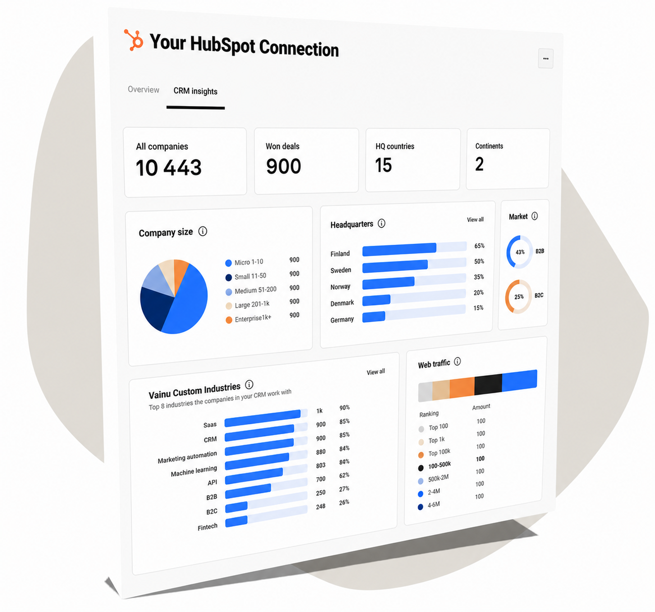
Creating a CRM insights dashboard
The Brief
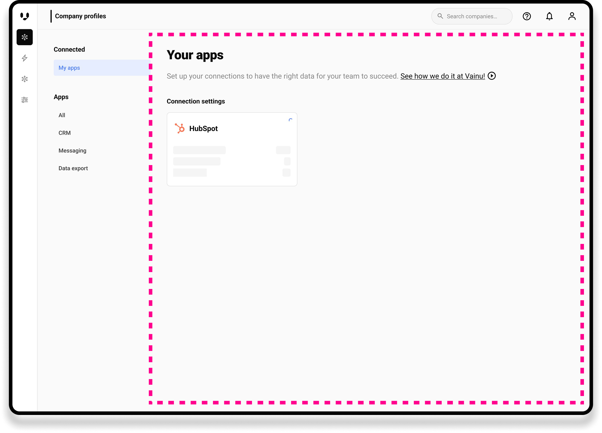
Use case: How might we help users better understand what type of companies they have in their CRM so that Vainu can help them improve the content to make a more effective business?
Background: We wanted to offer users a quick overview of their CRM companies when they connect with Vainu. In the future, they could compare them to won deals and also create new target lists of similar companies with one click.
Tools: Figma and Invision
1. Refining and understanding
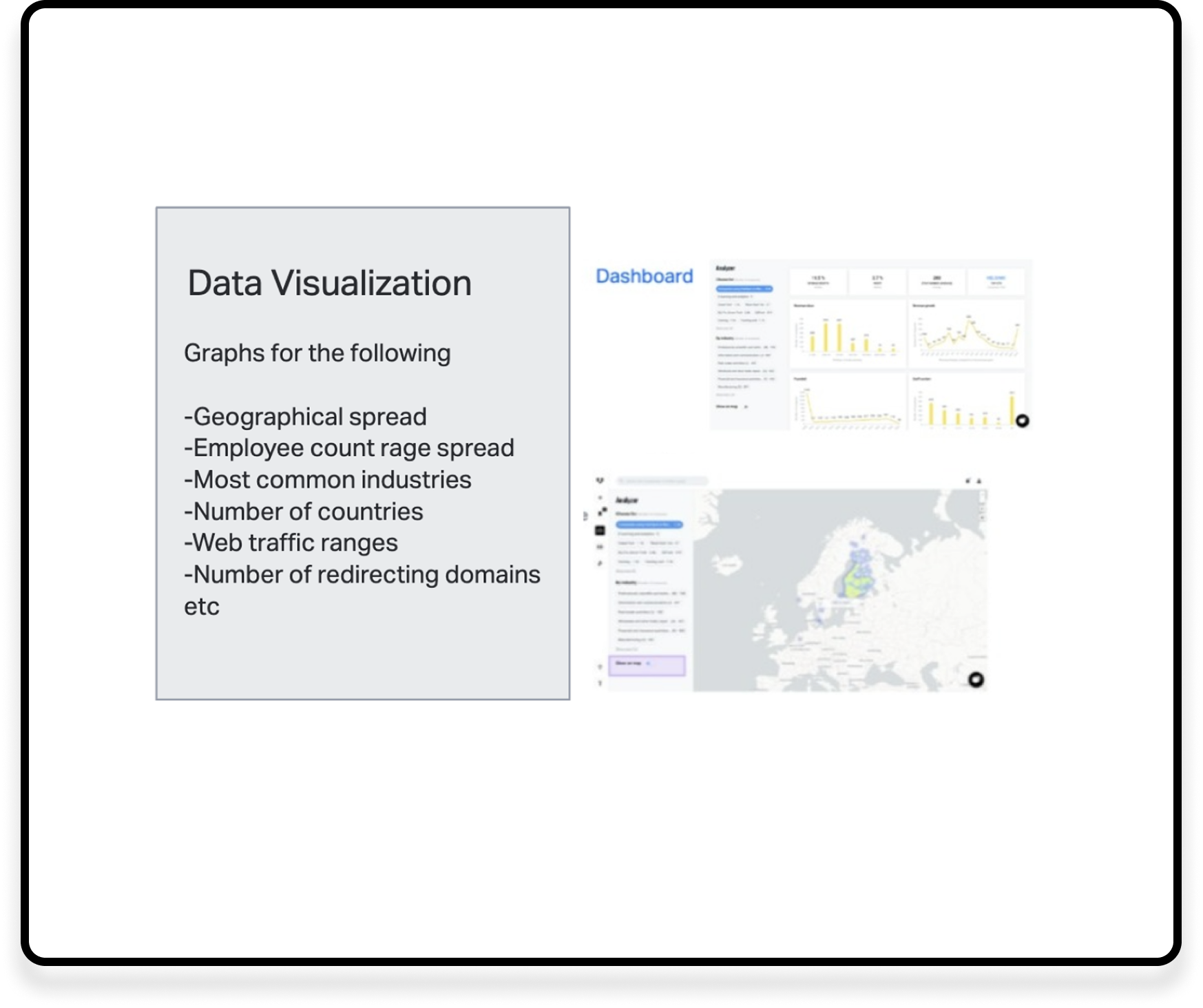
First, the idea was quite broad and it required planning and definition with stakeholders of what type of data users would find helpful and how we can provide it most effectively to them. I got a list of the data points we would need to show.
Also, I got some examples of how we used to visualize some data in the old platform.
2. Quick drafts to build the idea
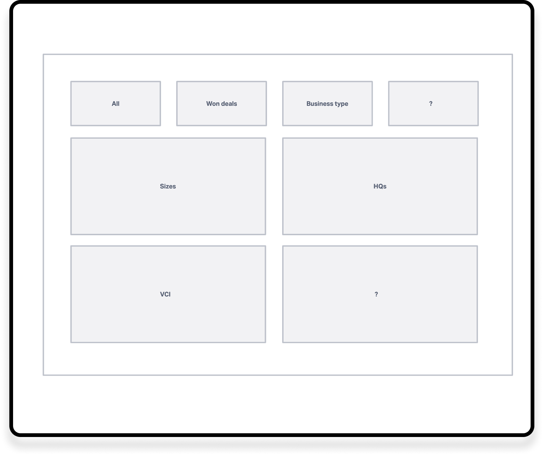
I started with quick drafts to explore different chart layouts and make the concept more concrete
3. More detailed wireframing and technical exploration
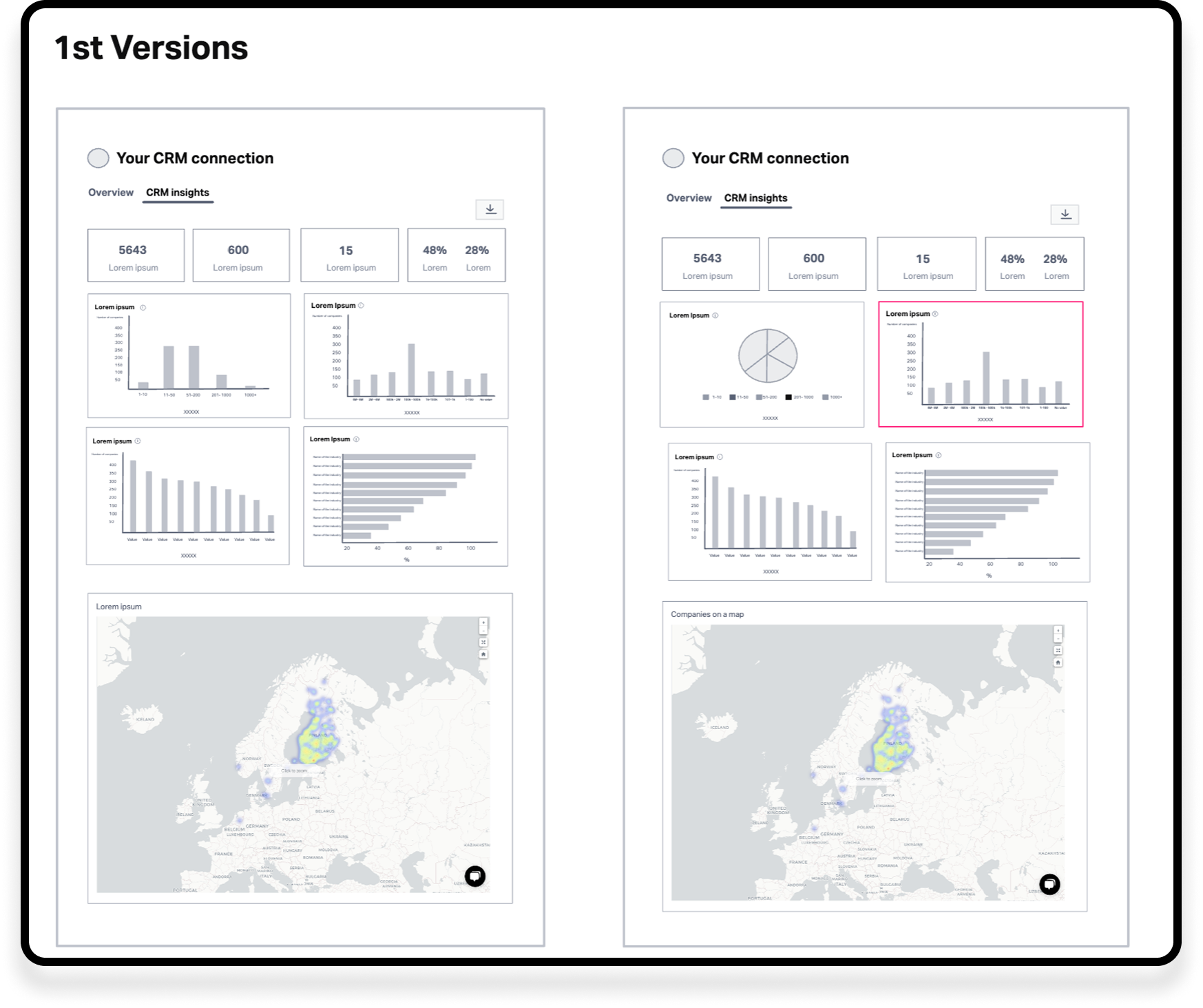
I reviewed the first drafts with stakeholders and developers to gather feedback and understand the most sustainable way to build and maintain the data visualizations.
Through these discussions, I learned that the existing chart library wasn’t the best fit for what we wanted to achieve. Together with the developers, we explored alternative approaches and discussed their possibilities and technical constraints.
Based on these insights, I went back to the designs and started another round of iterations, this time with a better understanding of what would work both for the user experience and from a development perspective.
4. Further iteration and validation
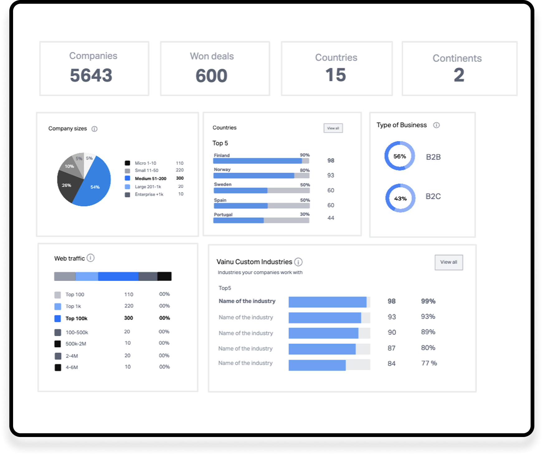
We decided that building new data visualization cards from scratch would be a more flexible and maintainable solution. I used the ideas and technical insights I gathered from my discussions with the developers to create a new round of drafts.
This was my first time designing a dashboard at Vainu, so I took the opportunity to deepen my understanding of dashboard and data visualization design. I explored best practices for creating clear and useful dashboard cards and reviewed my ideas with other designers to gather feedback.
Based on what I learned, I continued iterating and refining the designs.
5. From wireframes to high-fidelity design
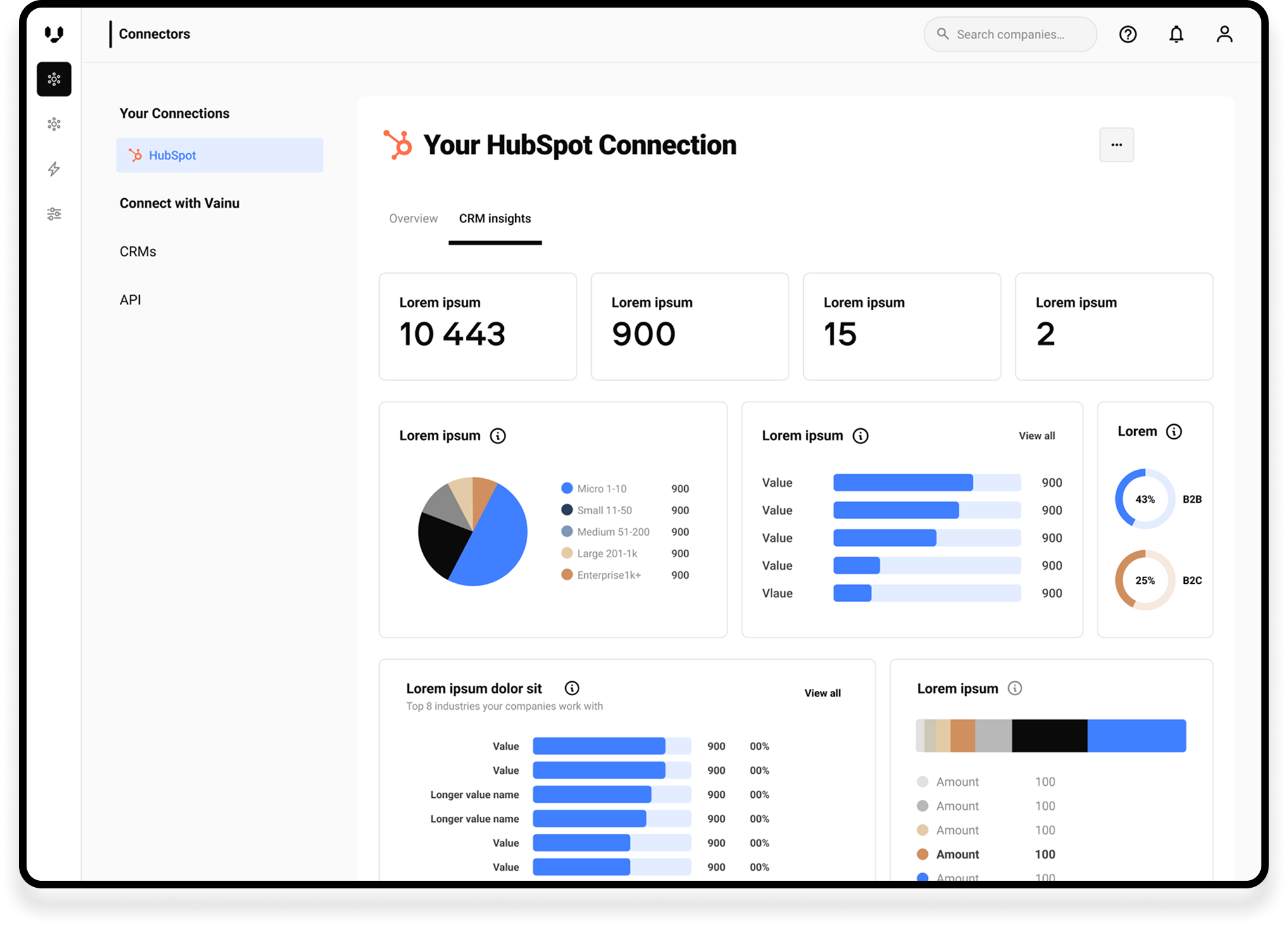
I moved from wireframes to high-fidelity design, building the dashboard and its reusable components in Figma. Once the first versions were ready, I started gathering feedback to validate the design and identify areas for further improvement.
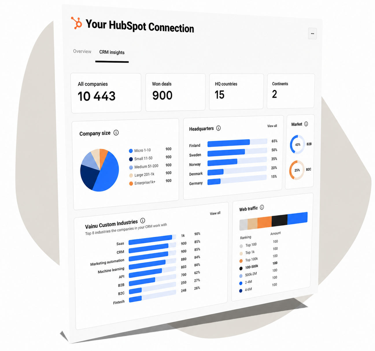
The final designs were ready. The new dashboard was placed in its own tab next to the CRM Connection Overview, giving users a more visual and detailed view of their CRM connection status.
Next steps
We wanted to gather feedback from the users and edit the CRM insights board based on it
Stakeholders wanted to start with these datapoints but, later, there would be more interesting data to show on the dashboard
This view and also adding it as a new tab next to the CRM overview page gave a lot of flexibility to create more information about the users’ CRMs in the future