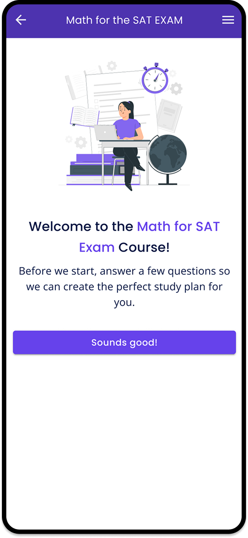
What If We Started with What Users Loved Most?
User research uncovered the product's biggest motivator—and reshaped the entire onboarding experience.
Listening to Our Users
We had an issue with Happi product: It was a new study platform for SAT exams. Nobody knew about it in US. We had marketing processes but we also needed to introduce the product in a motivating manner so that users would get interested in itand understand the value of the product as early as possible.
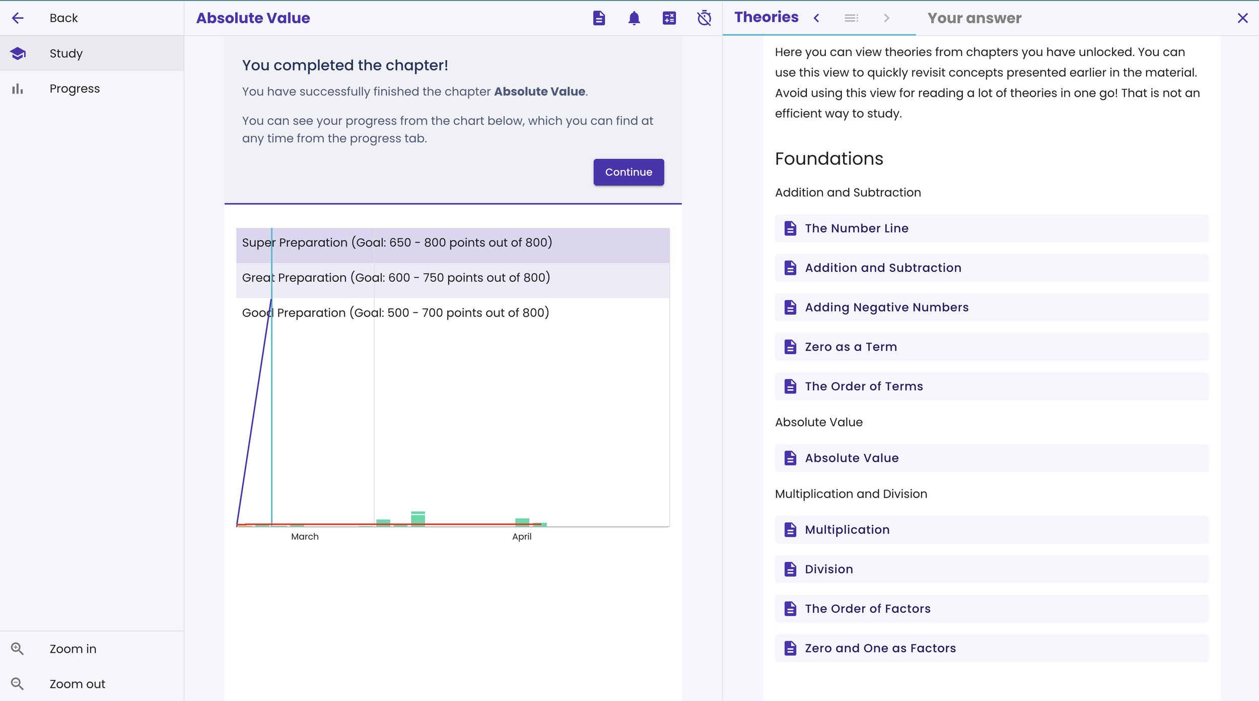
The application featured a progress bar that helped students track their study activity and monitor their progress toward the goals they had set.
The usability testing showed that the issue was that the progress bar was shown very late in the app after the user had studied for a while. Additionally, the progress bar wasn’t very self-intuitive and it took time for users to understand it.
BUT: when they did understand it, they loved it! Every participant mentioned how the progress bar had motivated them.
Based on this, we decided to make this motivator more visible and introduce it in an earlier stage. We also wanted to make it self-intuitive so students would understand it immediately after seeing it.
Solution: Interactive Onboarding flow
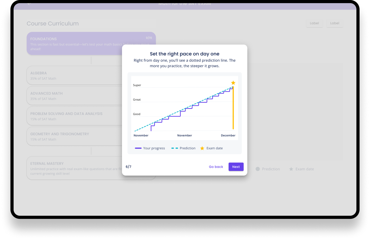
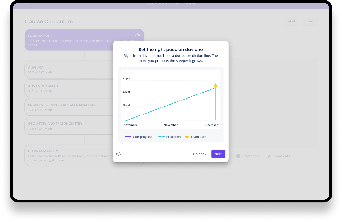
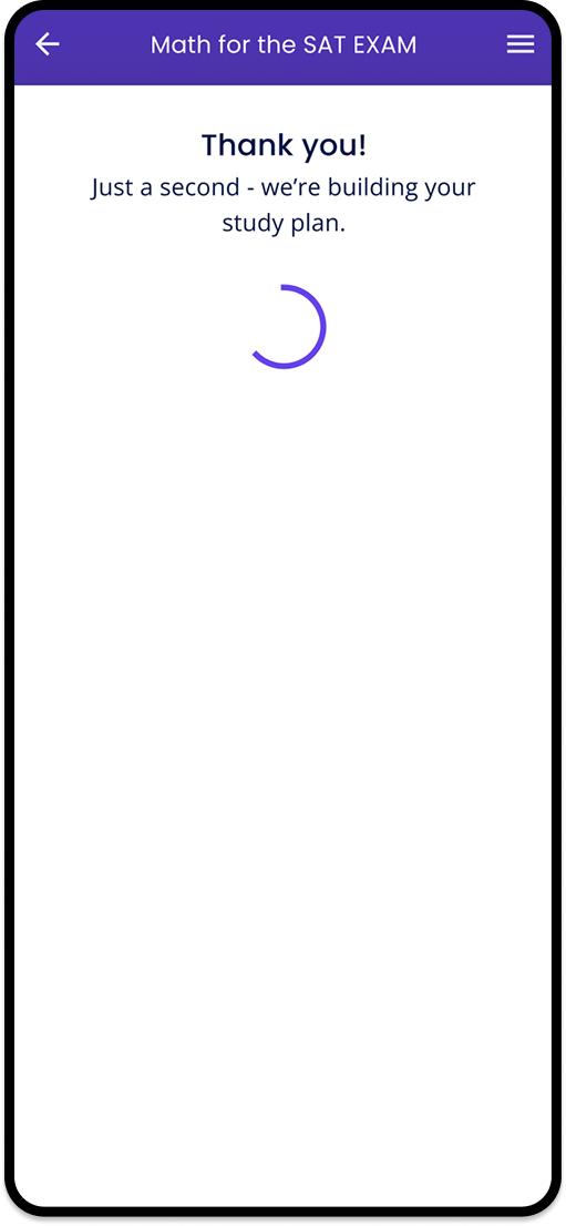
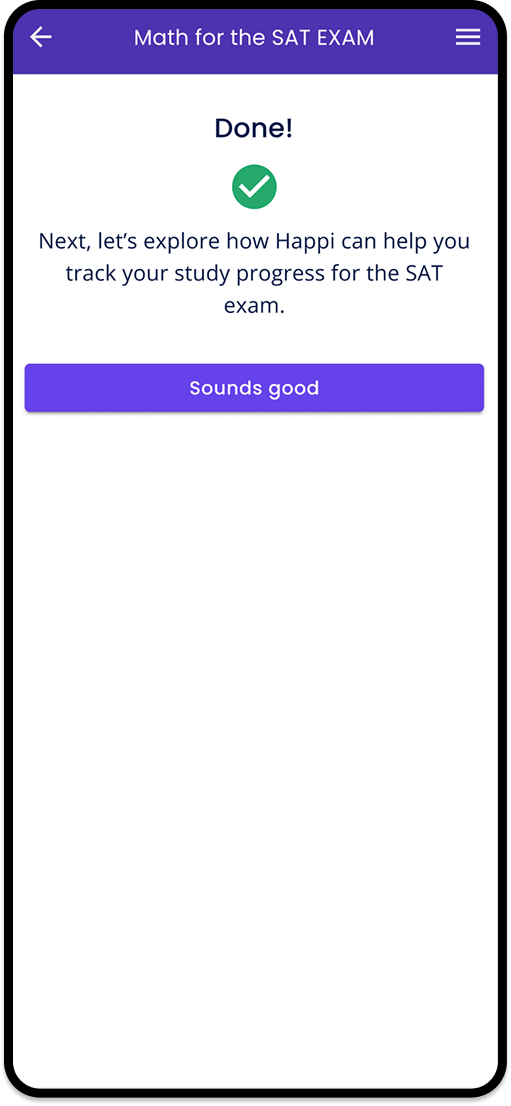
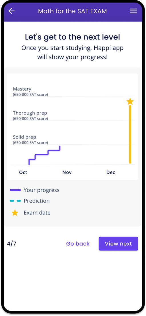
We build an interactive onboarding flow where the users will set their goals and see immediately how they can start to track their progress with the progress chart.
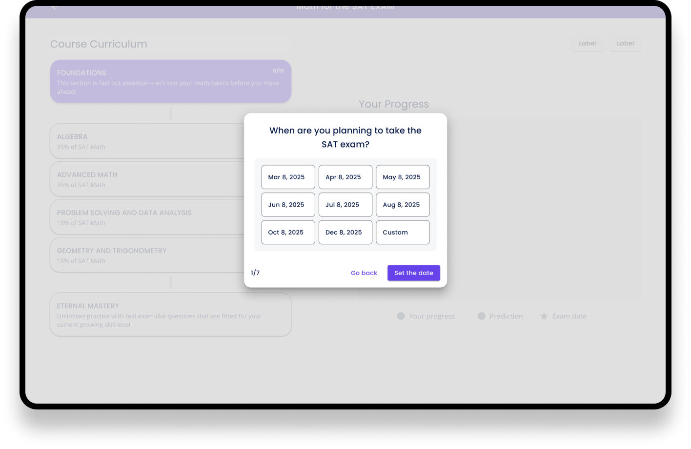
Setting the goal
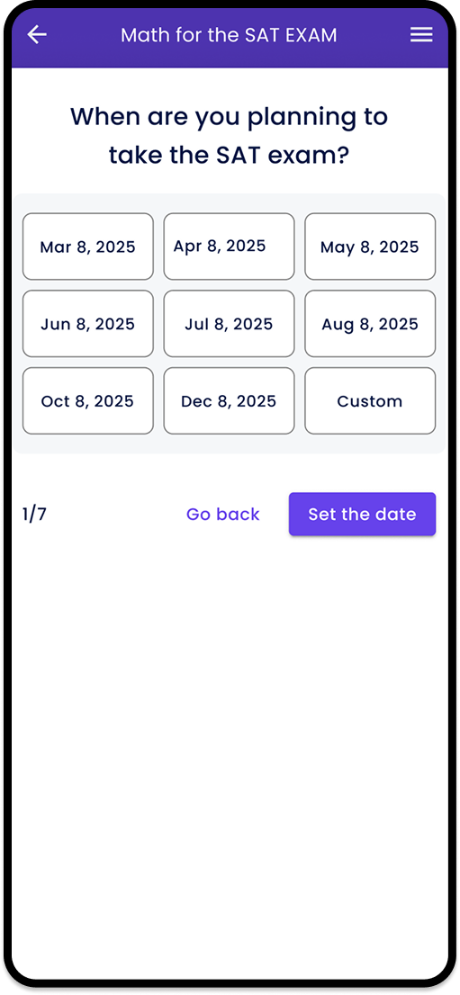
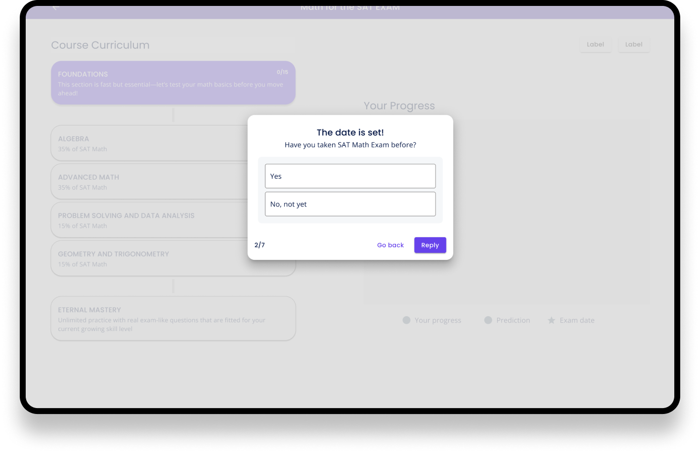
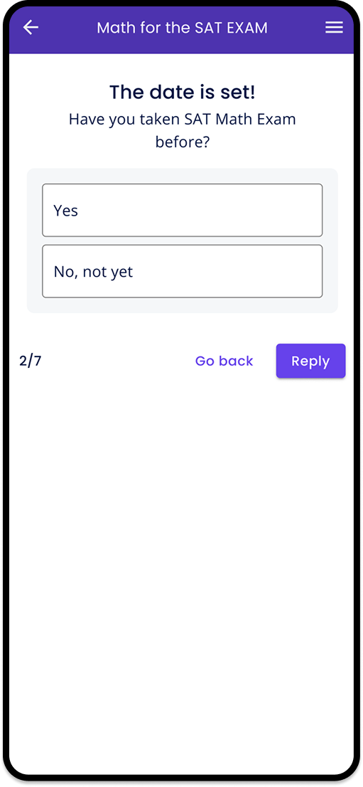
During onboarding, users were asked to enter their planned SAT exam date to build the goals and to set the goal in their own mind as well.
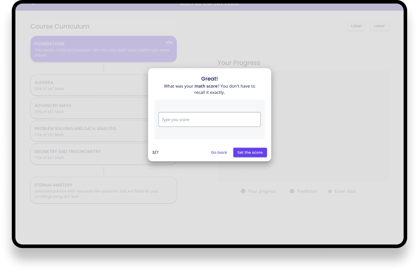
Previous exam scores

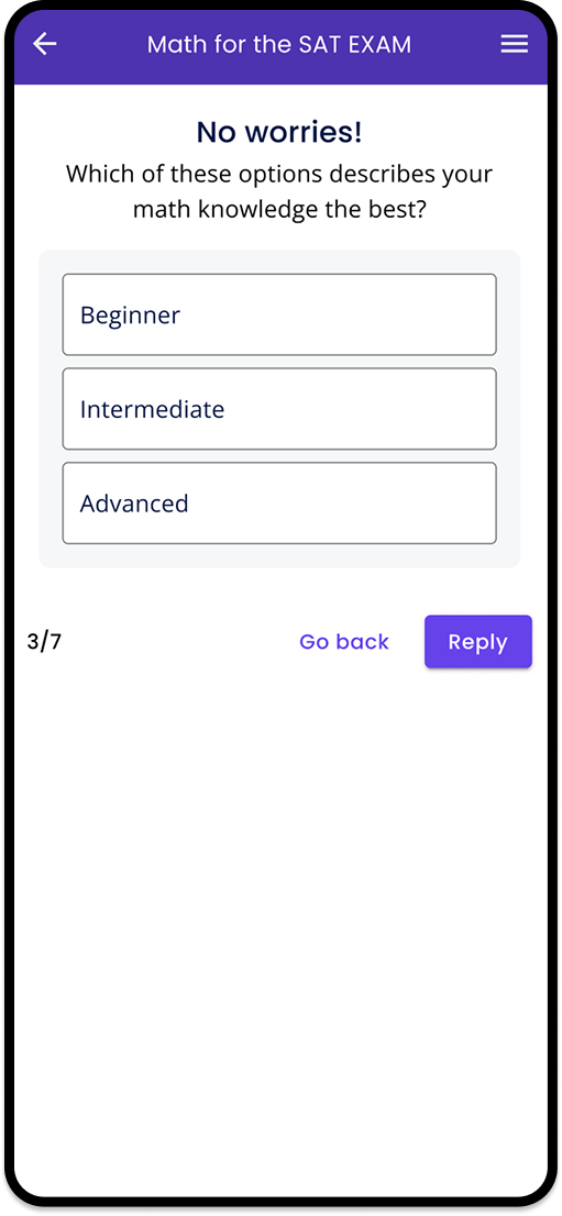
These introductory questions allowed us to personalize the study plan while reminding users of any previous exams they had taken.
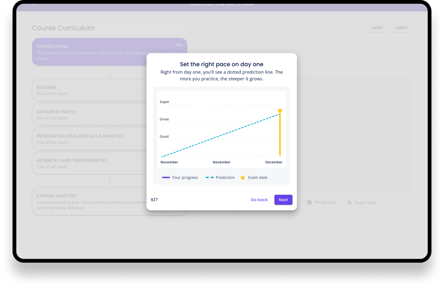
Introduction of the chart
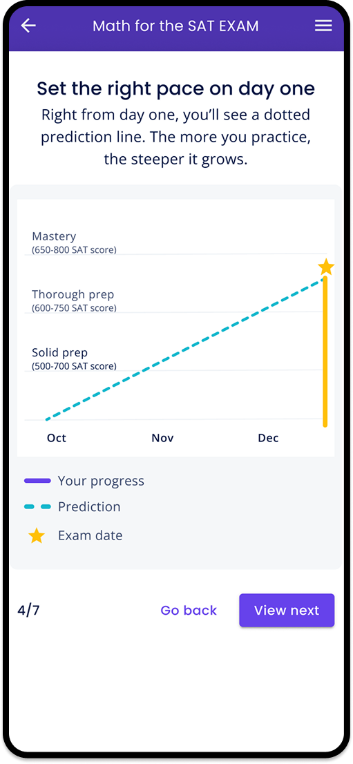
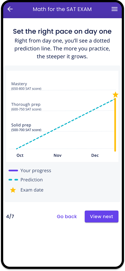
We used subtle animations during onboarding to introduce the progress chart and explain how it supports users throughout their learning journey.
Friendly language
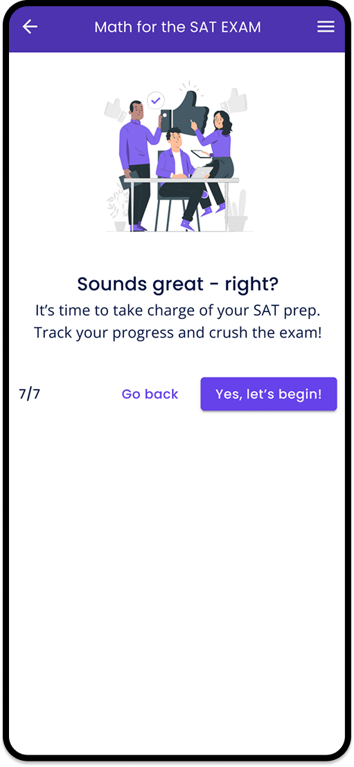
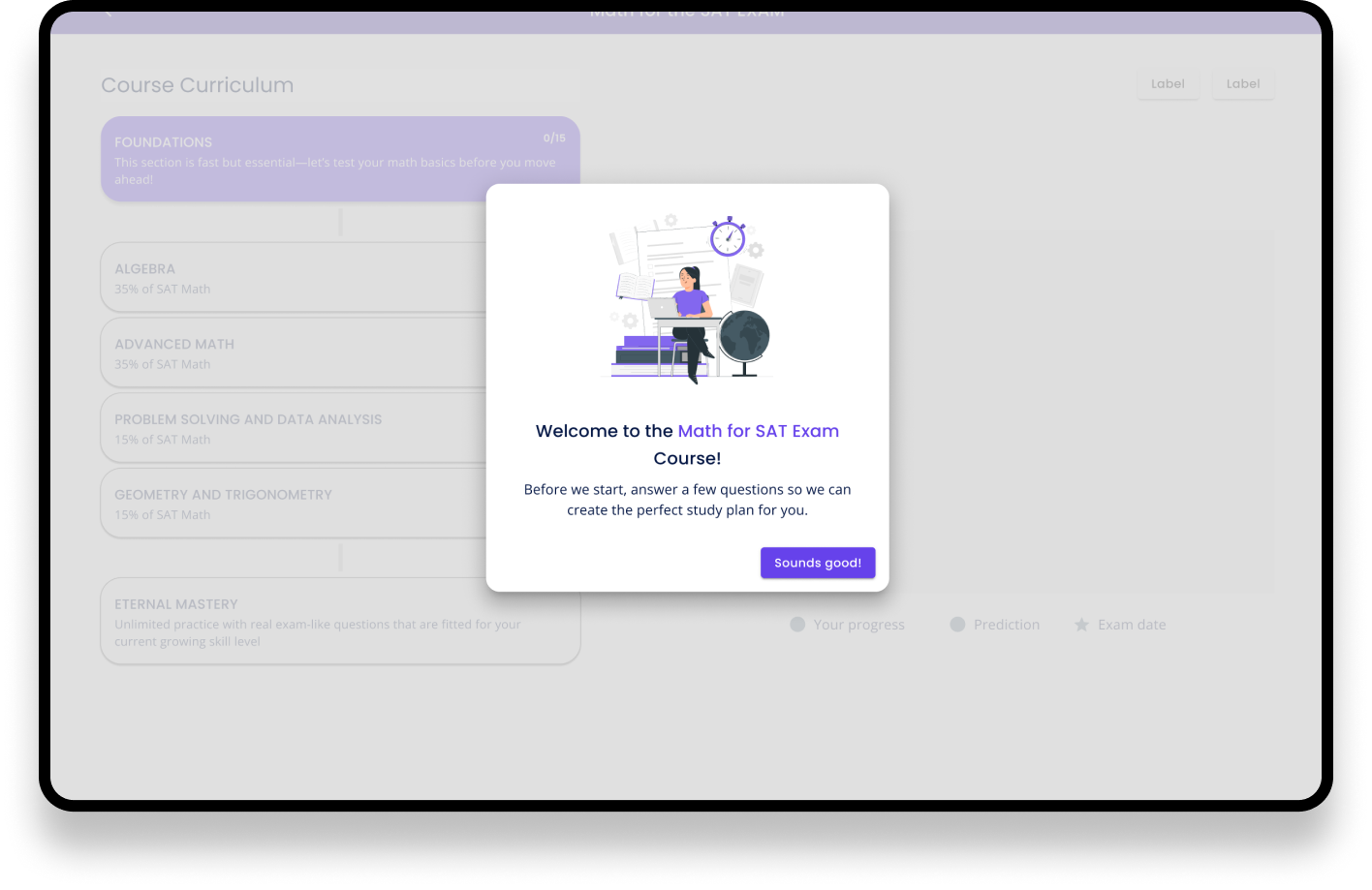
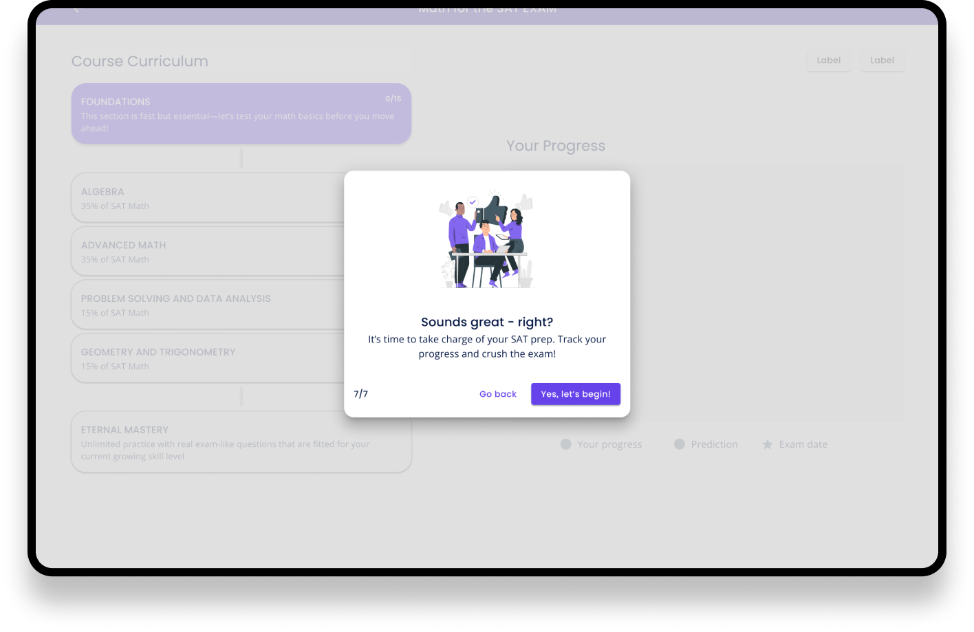
We designed the onboarding to feel conversational and human, creating the experience of a teacher guiding a student through the first steps.
After onboarding
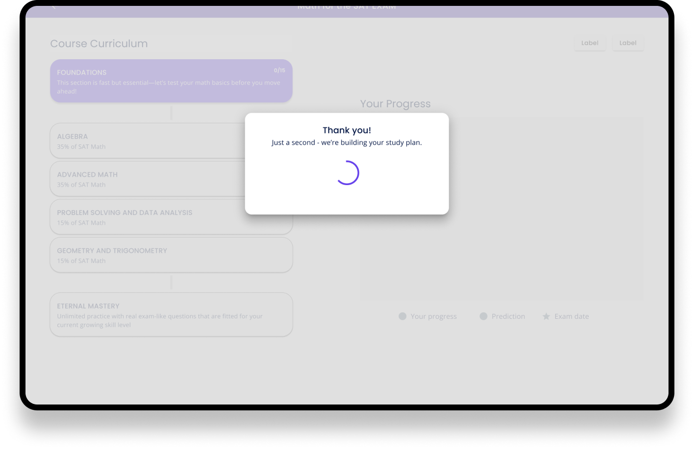
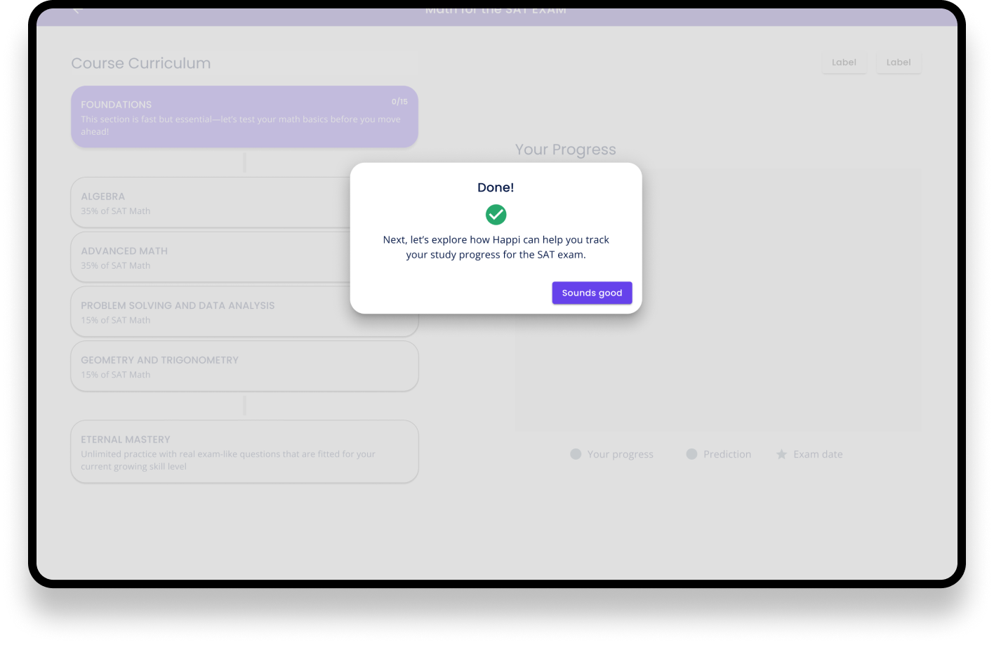
After onboarding the user would land on the Table of Content view of the Course they are about to study. The goal the user set will be shown in the chart on the right and user has already an idea how the progress will start to appear on the view.
Unfortunately this stage was not ready and you can’t see the set goal. I was already heading to parental leave at this point and another designer took over at this point.
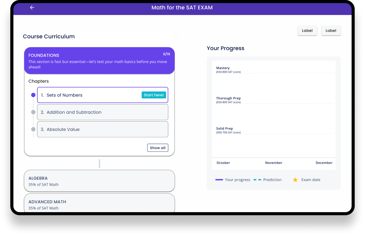
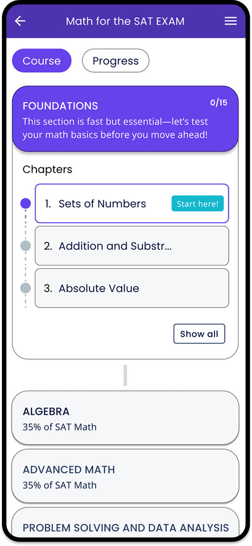
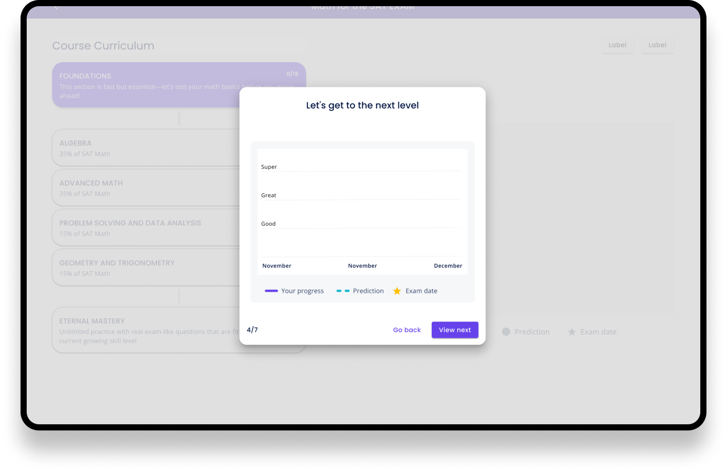
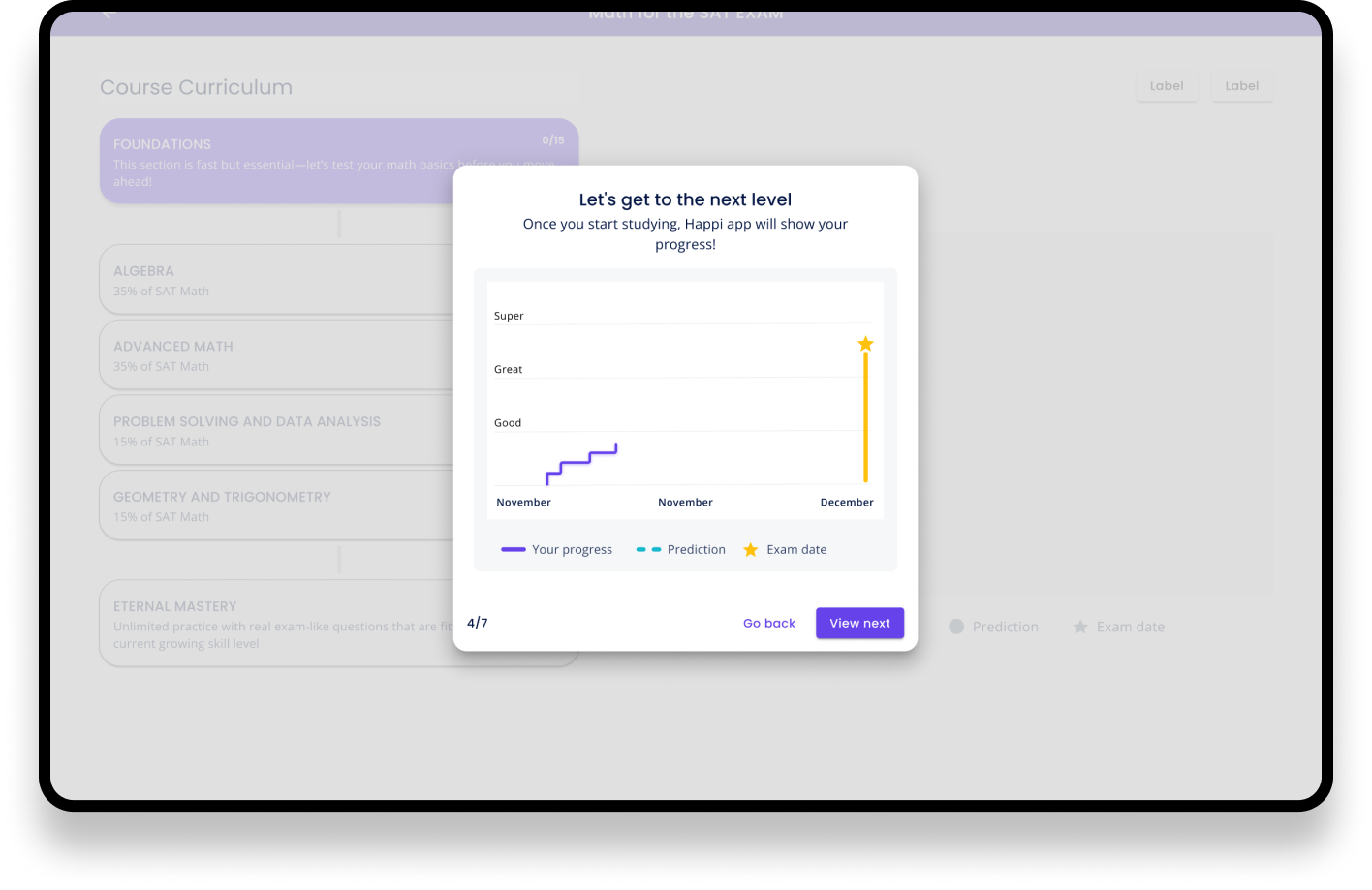
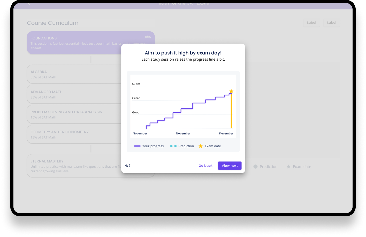
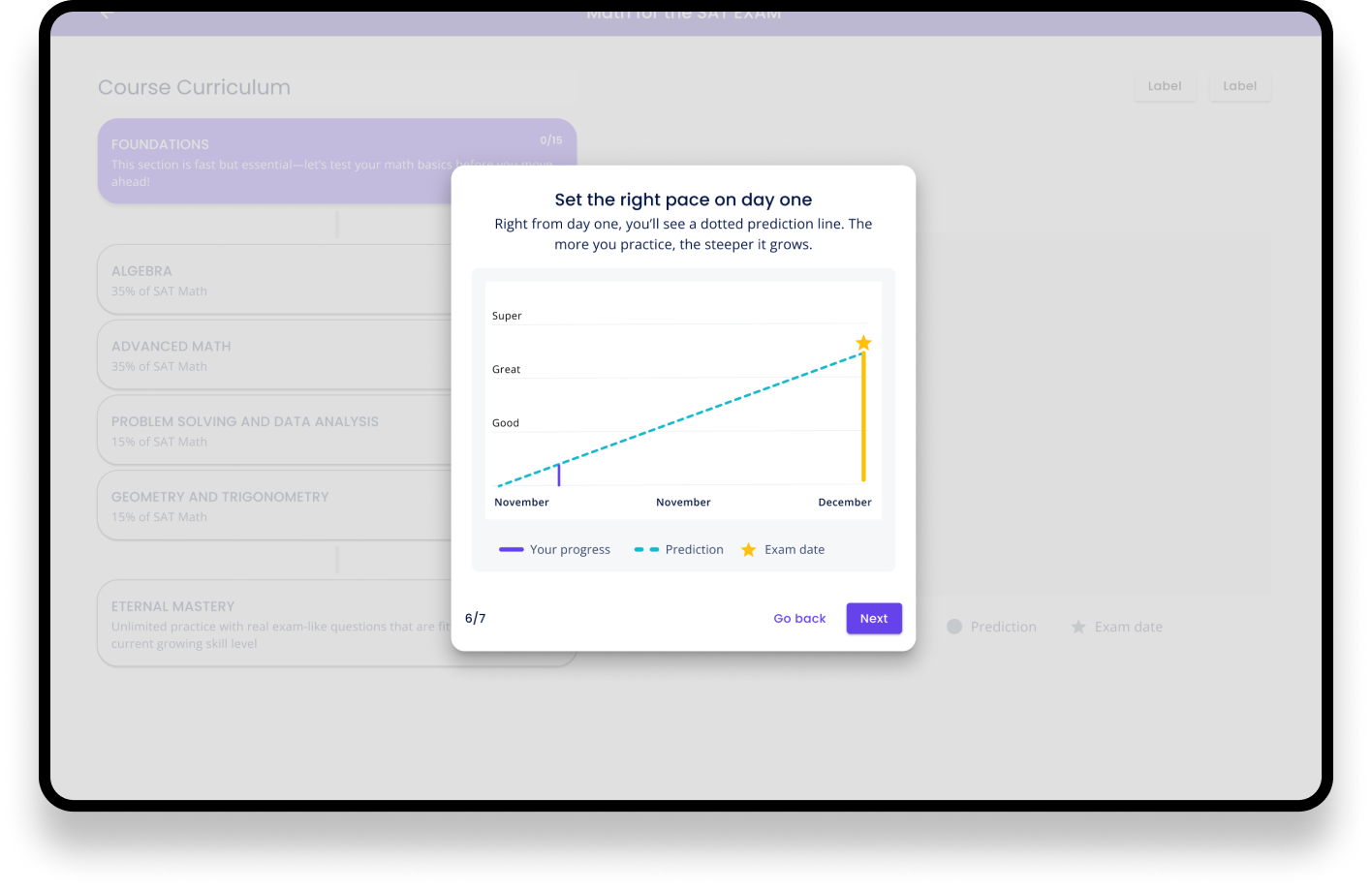
The Table of Content page required iterating but we planned to test it as it is so that we could improve it later
The main elements were there but it could have been improved, especially the UI was not finalised
Usability testing; how did the users find out the onboarding flow and did they understand how to follow the progress after studying a chapter or two
How the user can edit their goal if e.g. the date of the exam will be postponed
Next steps