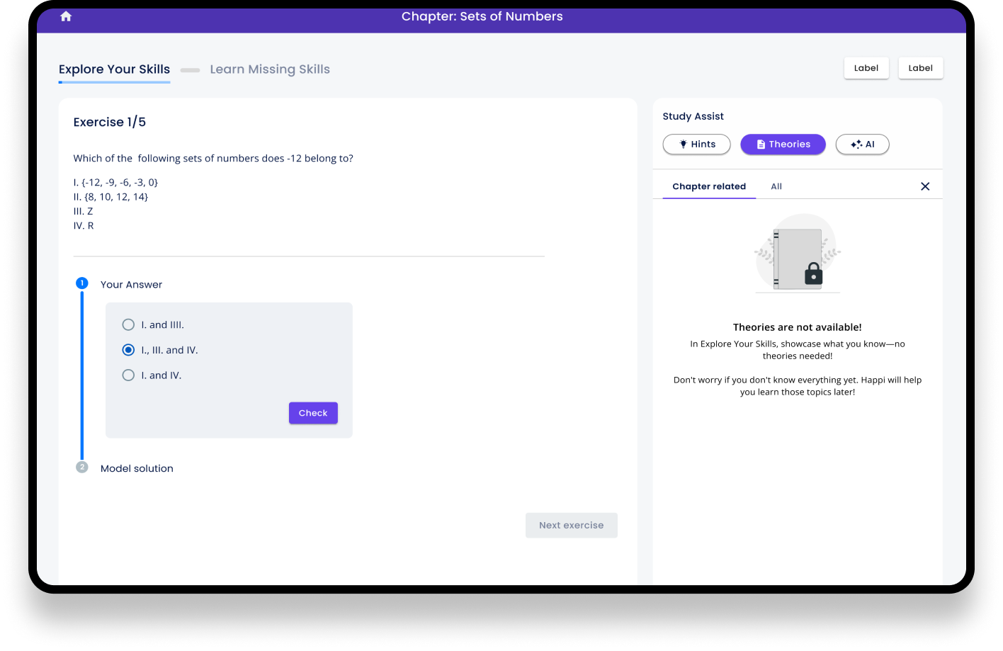
Streamlined Study Experience
Before I joined the company, there had never been a dedicated designer working on the product. As a result, the study app had gradually become cluttered over time. Instead of rethinking the overall structure, new features had simply been added to the existing interface, making the experience increasingly complex. The application had a lot of UI debt over the years.
Brief
Usability testing showed onboarding issues
This eventually became a usability challenge. The crowded interface made the app difficult to approach, and usability testing showed that many students struggled when using it for the first time. However, once they became familiar with the navigation and reached the learning materials, they valued the quality of the content and enjoyed using the product. The company's strong reputation also helped overcome the issues of the user interface, and the app was really liked by students despite its outdated design.
The US market required a smooth start
The situation became much more critical as the company prepared to launch in the United States. Unlike in Finland, the product had no established reputation, and there were no teachers available to introduce students to the app or explain how to use it. Users needed to discover the product on their own, understand its value immediately, and successfully navigate it without guidance. This made creating a clear, intuitive, and professional user experience essential for the success of the launch.
The main areas to improve
Create a Calm and Focused Learning Experience
The primary purpose of the app is to help students learn. To support this goal, we simplified the interface by removing unnecessary visual elements and prioritizing only the most essential information. The aim was to create a calm environment that allows students to focus on learning while giving them the mental space to think and absorb new information
Reducing Cognitive Load
One of the key goals was to make the app so intuitive that students could focus on learning rather than figuring out how to use the interface. By reducing cognitive load, more of their mental capacity could be devoted to studying.
Make support available without making it distracting
Theories, hints, and future AI assistance were easy to access when needed but intentionally de-emphasized to encourage independent problem-solving.
The guidelines
The stakeholders wanted to keep it simple – "like a book"
We had to consider and support 5 different exercise types
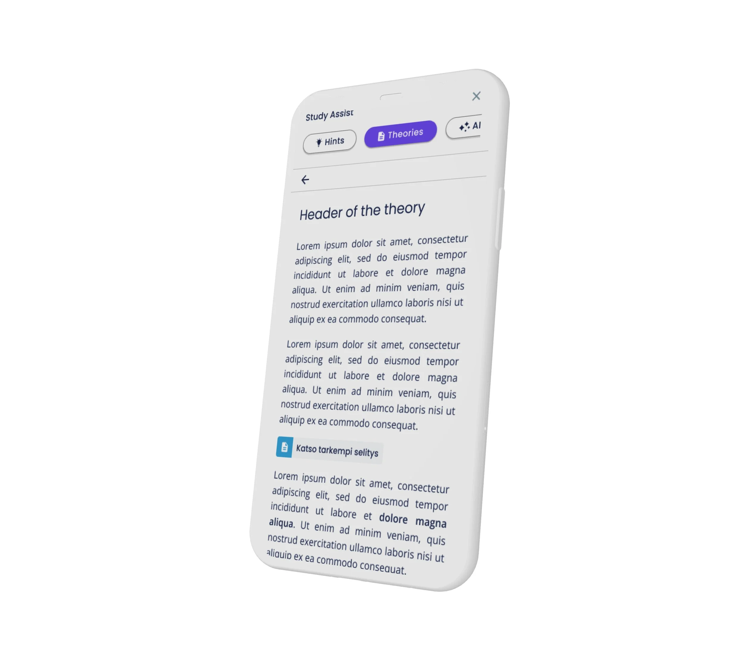
Teachers created the materials for theories: everyone had a different style
The deadline; We had to launch something new as soon as possible + I was about to start parental leave in few months
This redesign was part of a much larger product overhaul. While redesigning the study view, we were simultaneously creating many different steps of the whole product experience
Improvements
The problem 1: Multiple exercises
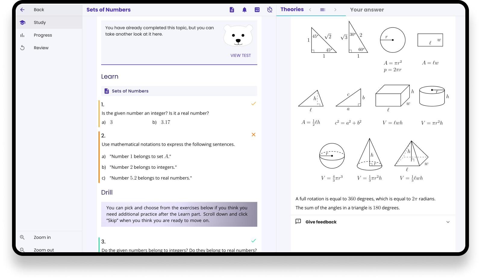
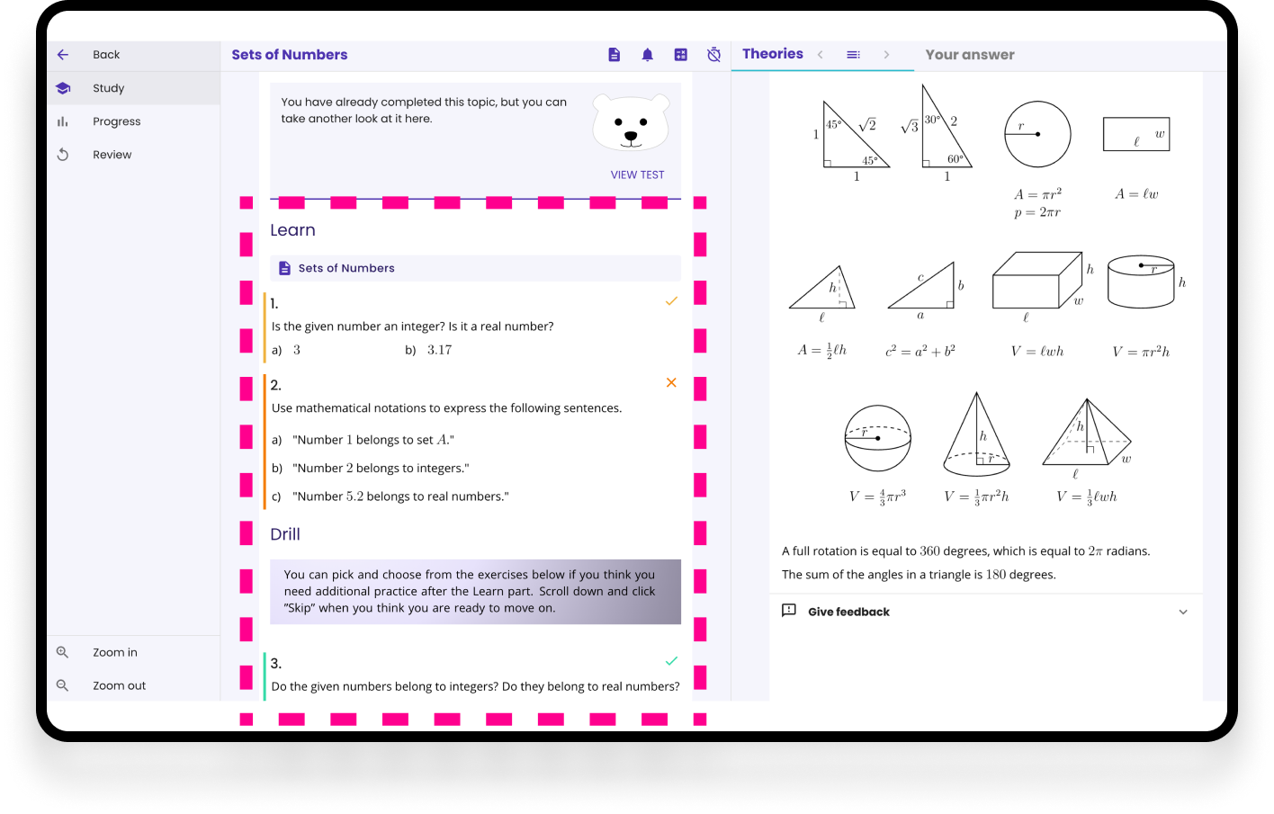
The exercise panel was cluttered because all exercises were displayed simultaneously. Some of the exercises were clickable, but they didn't look clickable.
Another issue was the progress: The chapter title was displayed at the top, but there was no indication of how many exercises the chapter contained.
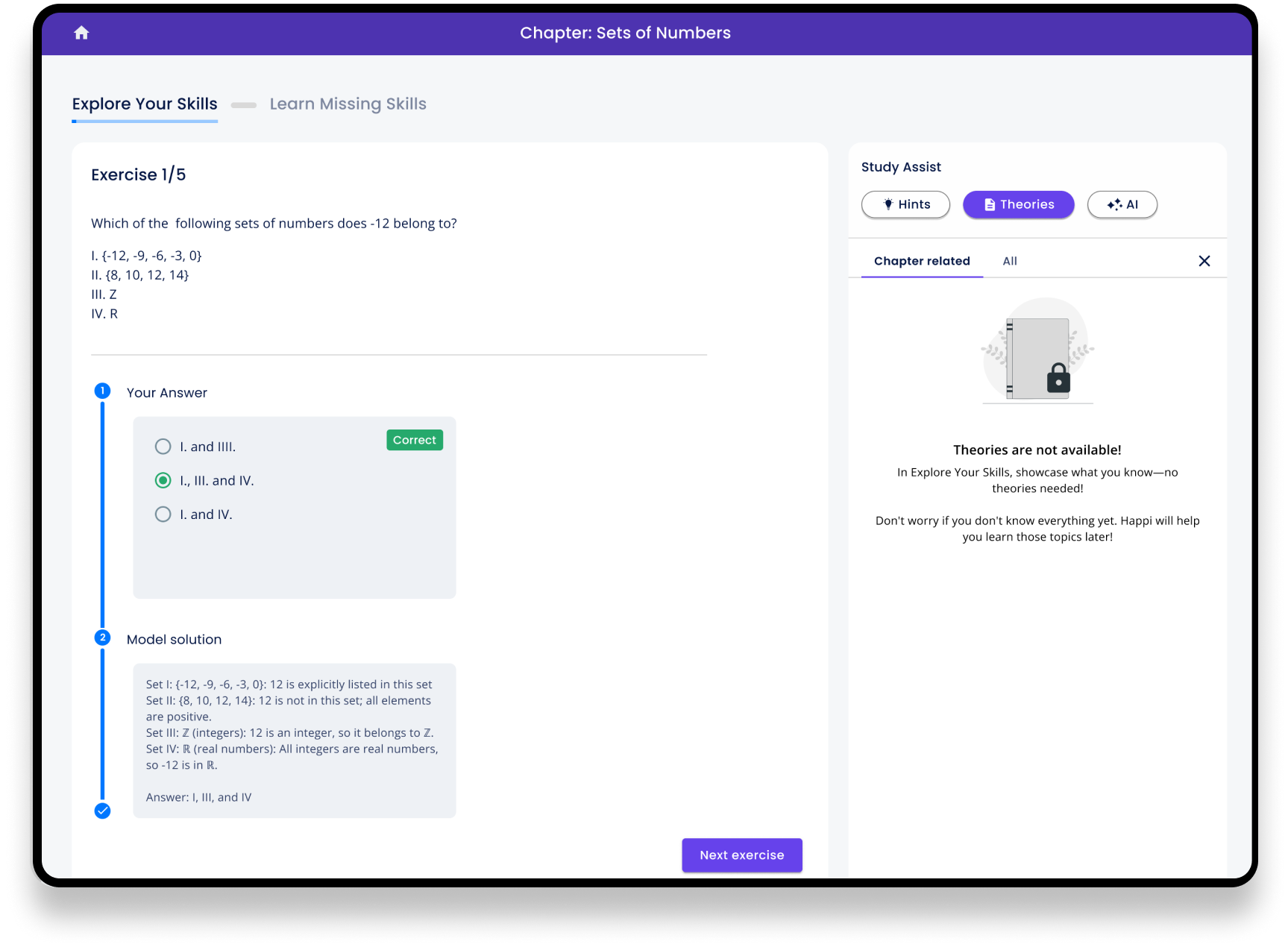
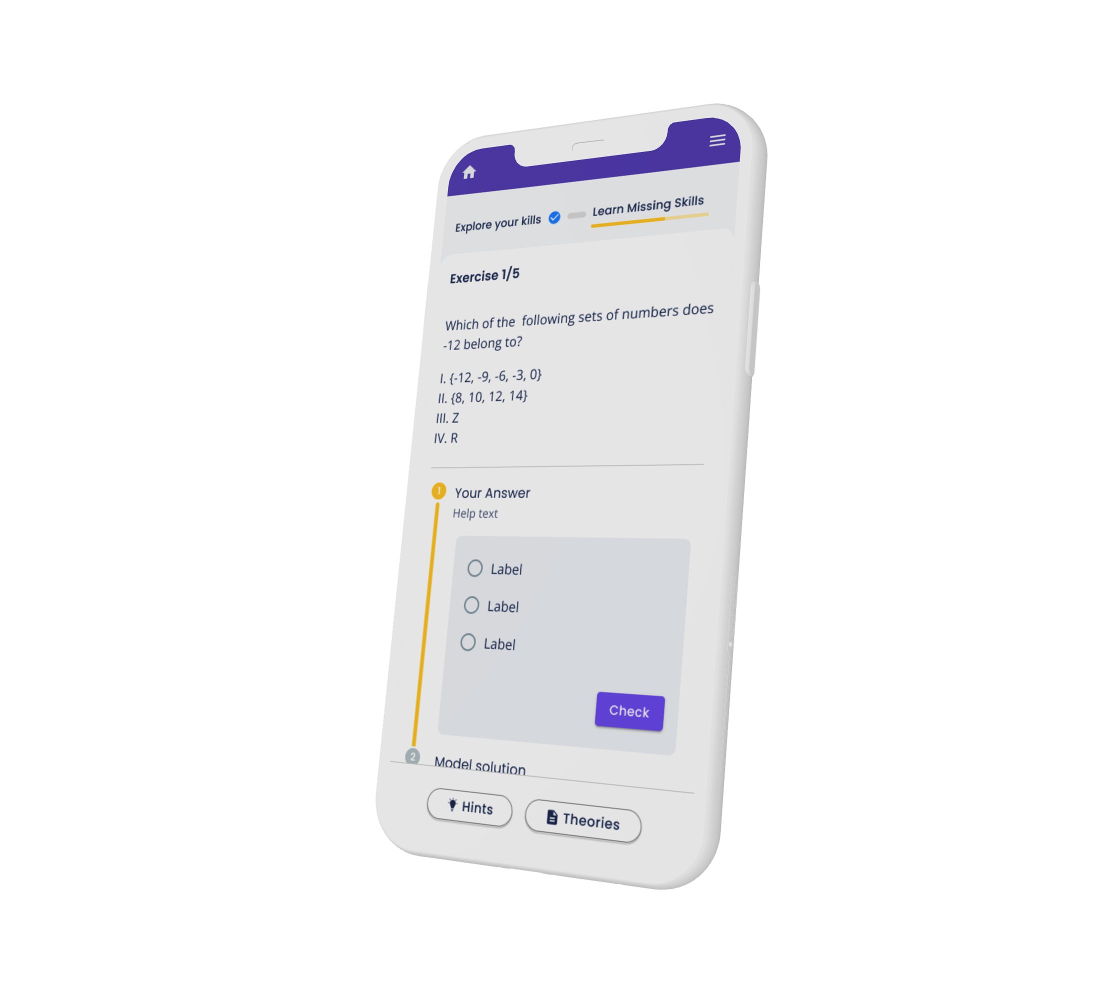
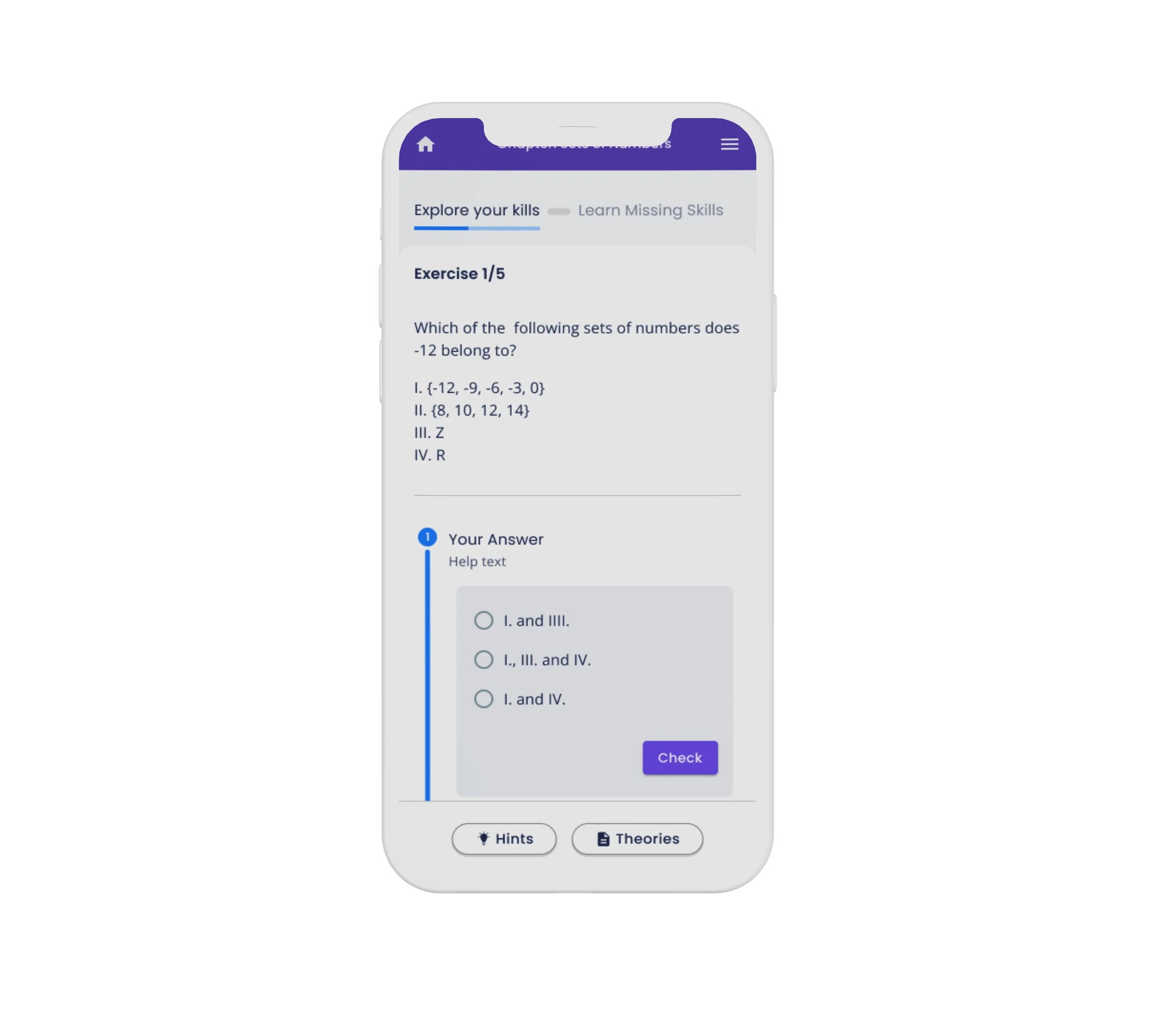
The solution: One Exercise at a Time
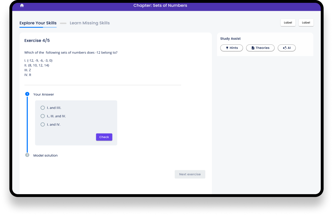
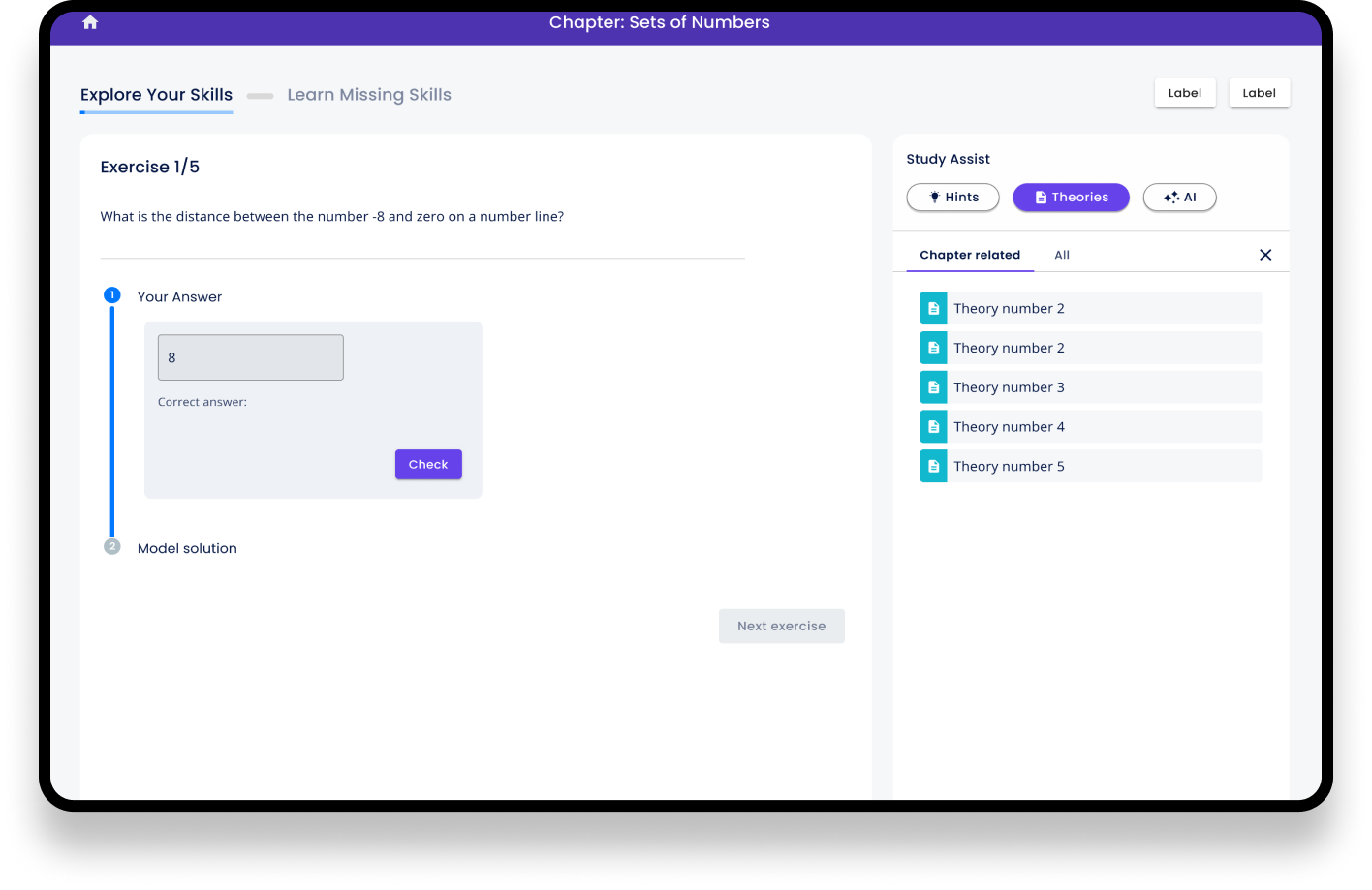
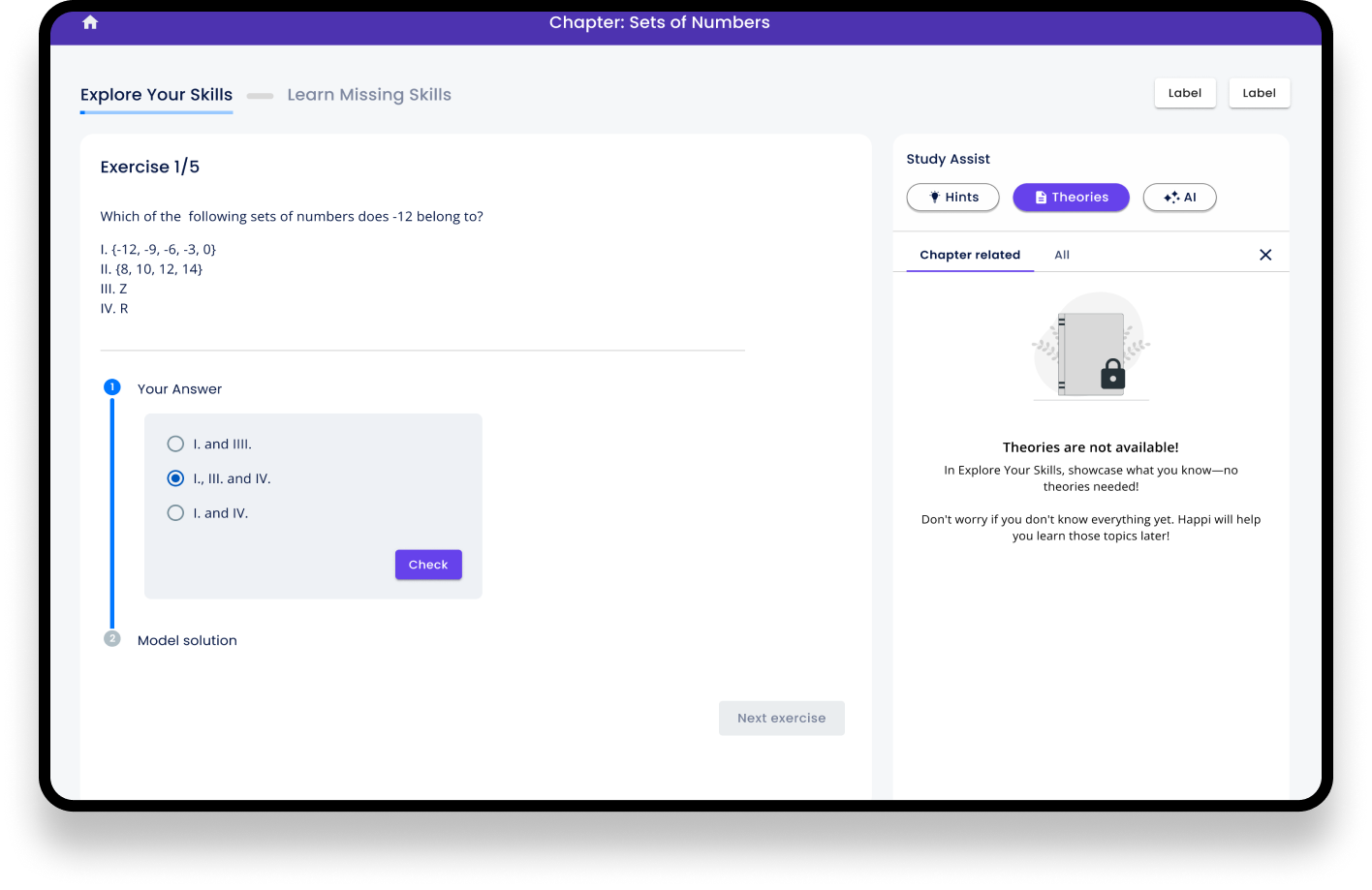
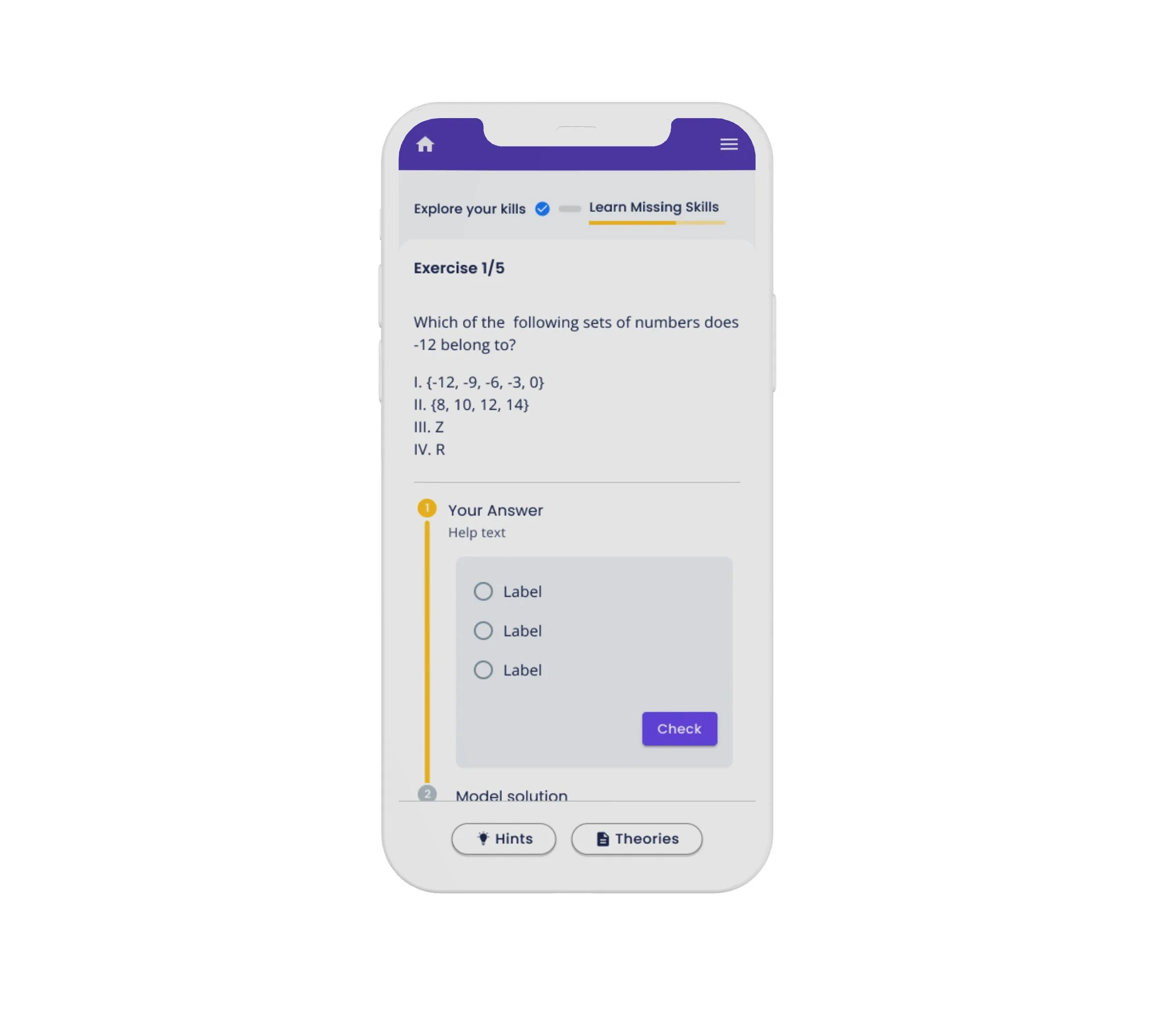
We redesigned the exercise flow to display one exercise at a time, reducing visual clutter and helping students focus on the task properly. A progress indicator at the top of the screen kept users informed of their progress through the chapter. The different sections Explore you skills and Learn Missing skills were both displayed at the top so the user would know what steps the current chapter includes.
The problem 2: Theories always visible
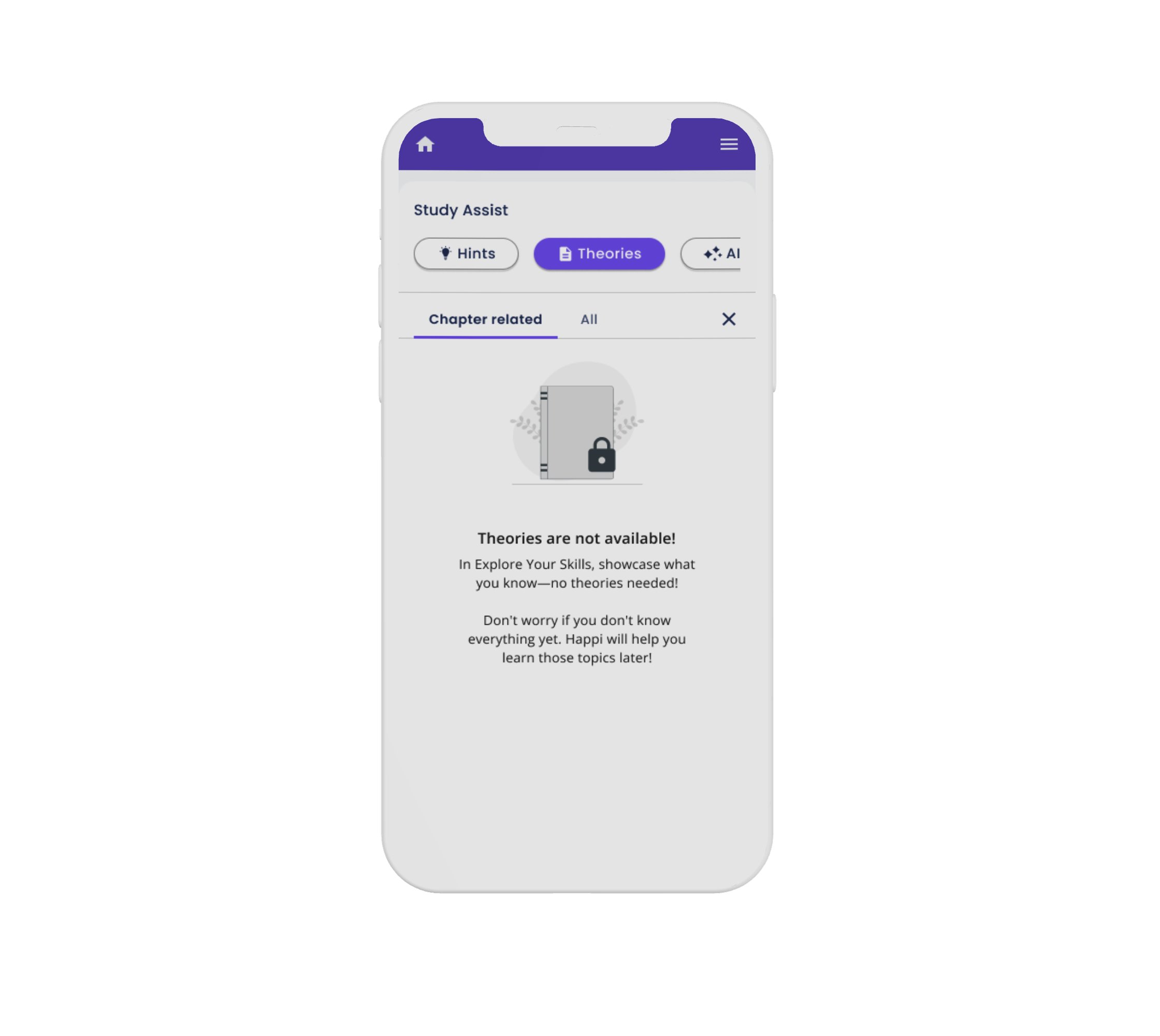
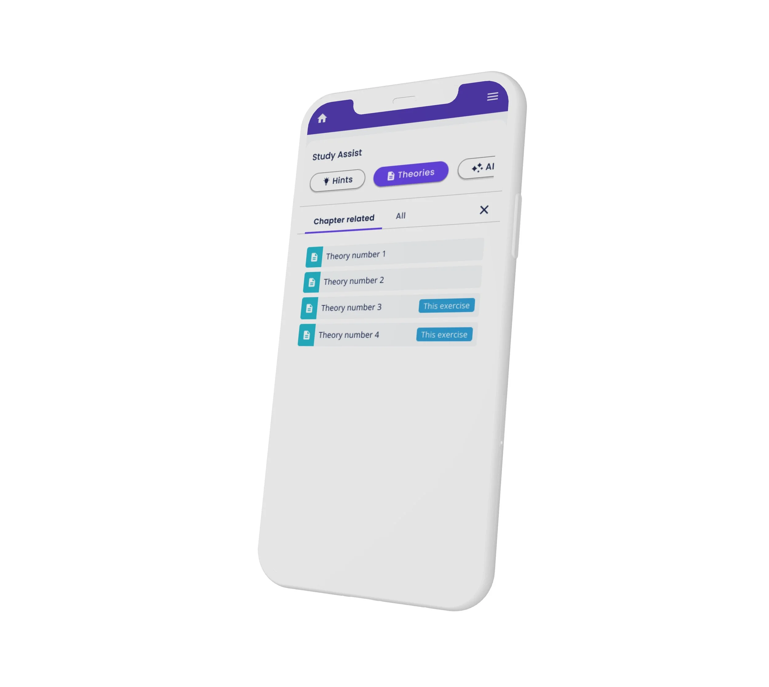
The users can use theories when learning new topics. The problem was that the theories could not be closed, and they cluttered the user interface in a distracting way, even when the user did not want to see them. Stakeholders did not want to provide too easy access to them, as they wished to encourage independent study before using the theories.
Users were also able to use hints but they were hidden behind clickable exercises so they were invisible until the user had tried to answer.
The stakeholders were also interested in introducing AI to help students in the future and we had to figure out where to display it.
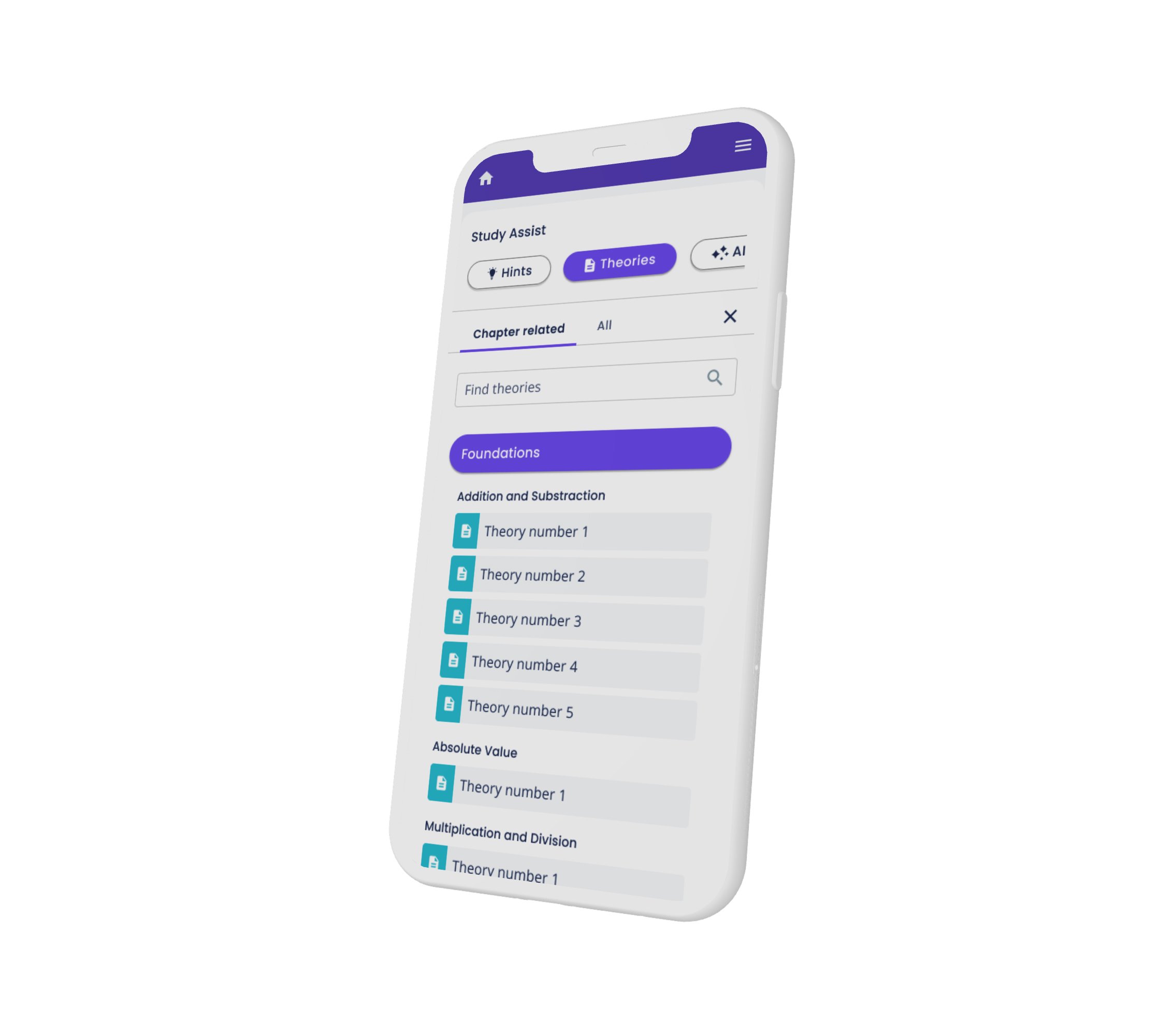
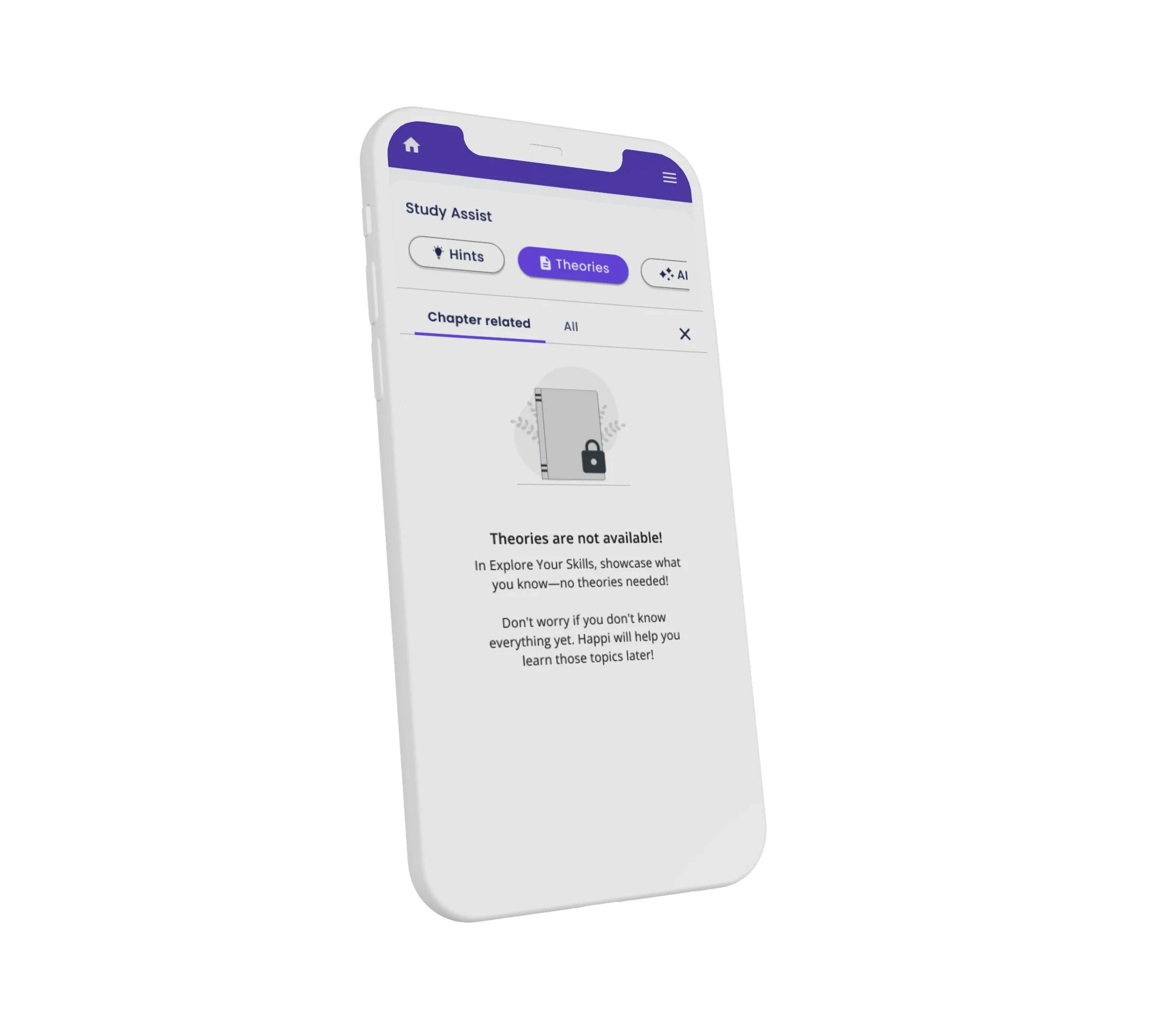
The solution: Study assistant
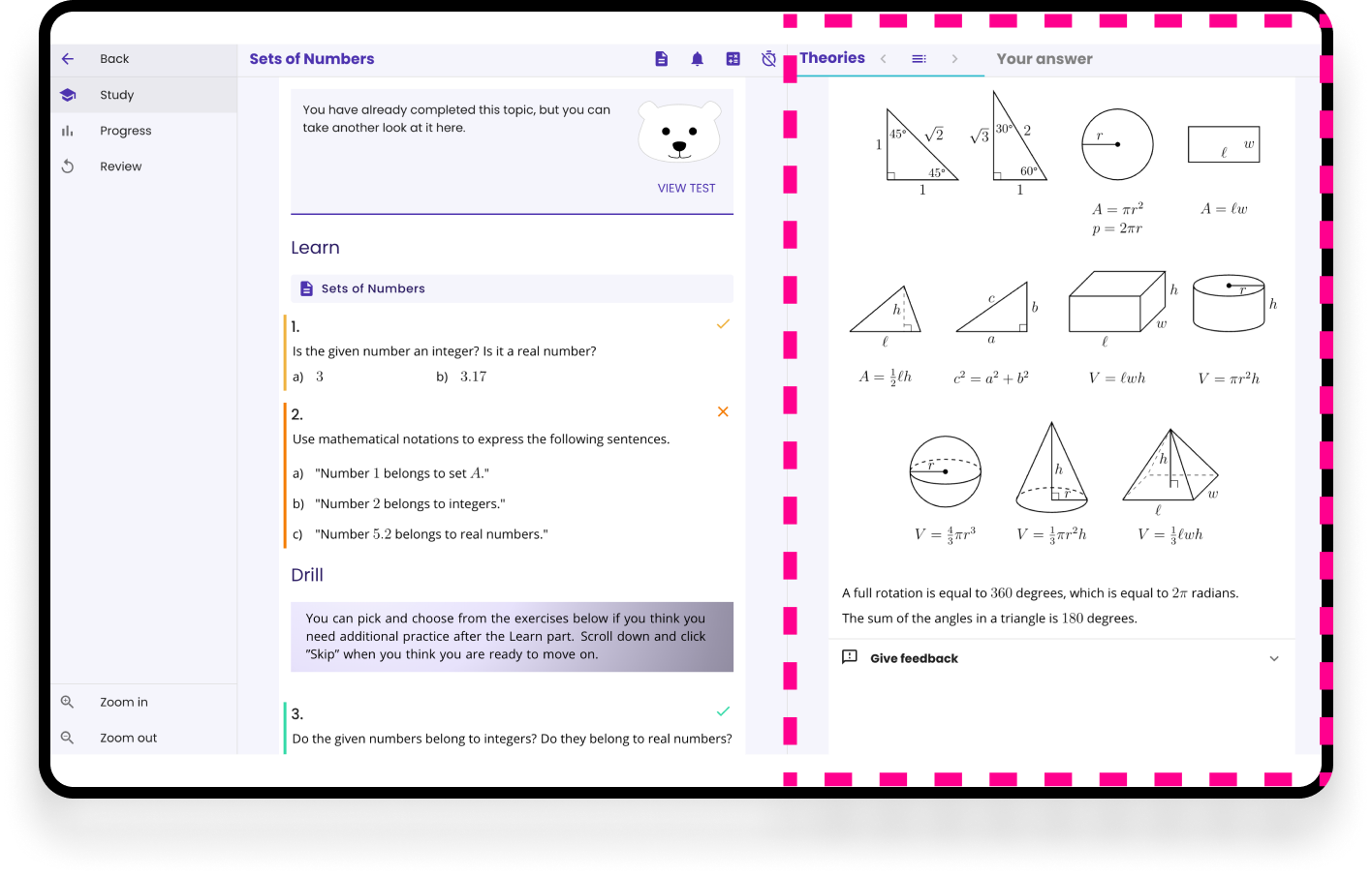
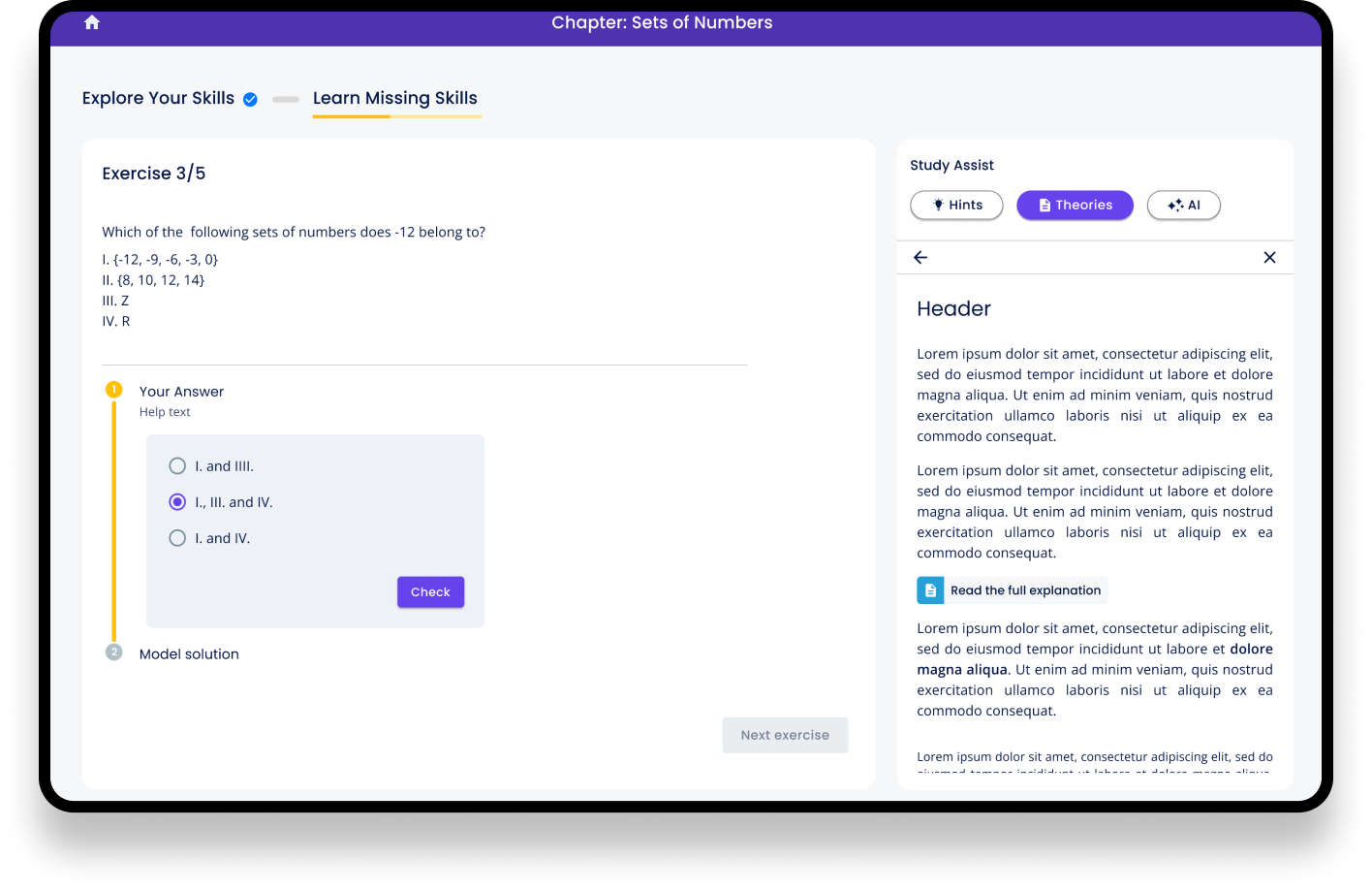
We introduced a Study Assistant panel that organized support materials more effectively. Users could collapse the panel to reduce distractions, and its flexible design made it easy to add and update content. The panel included hints, theory materials, and was designed to support a future AI assistant.
The problem 3: Confusing feedback
Do you see the small X and ✓ signs? Can you tell why some of them are yellow, some orange and some are green? What are the colored bars in front of the exercises?
Yep, this was the issue. The feedback wasn’t logical and we needed to create a proper, immediate feedback system that helps the users to understand when something was correct and when something went wrong.
The solution: Clear feedback
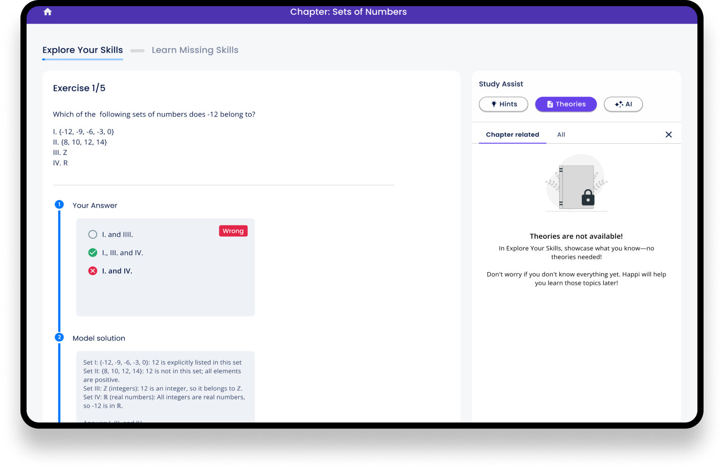
We created a clear and immediate feedback system that was embedded in the UI elements the user was interacting with.
The problem 4: Explaining the UI
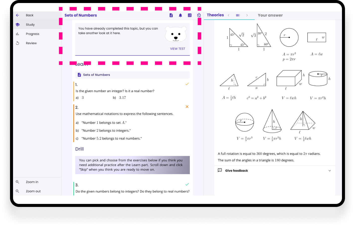
Because users struggled to use the app in the beginning, the company created a banner with a mascot that would explain what happens in the app. The static banner with the image was problematic;
The message of the banner disappeared in the clutter and often users did not even read it.
In addition, the bear was not part of the company's overall brand identity, making it feel disconnected from the rest of the experience.
The solution: Embedded guidance
We replaced the banner and mascot with contextual guidance built into the interface. By providing feedback and visual cues at the point of interaction, users could naturally learn the app as they progressed.
The problem 5: Illogical flow
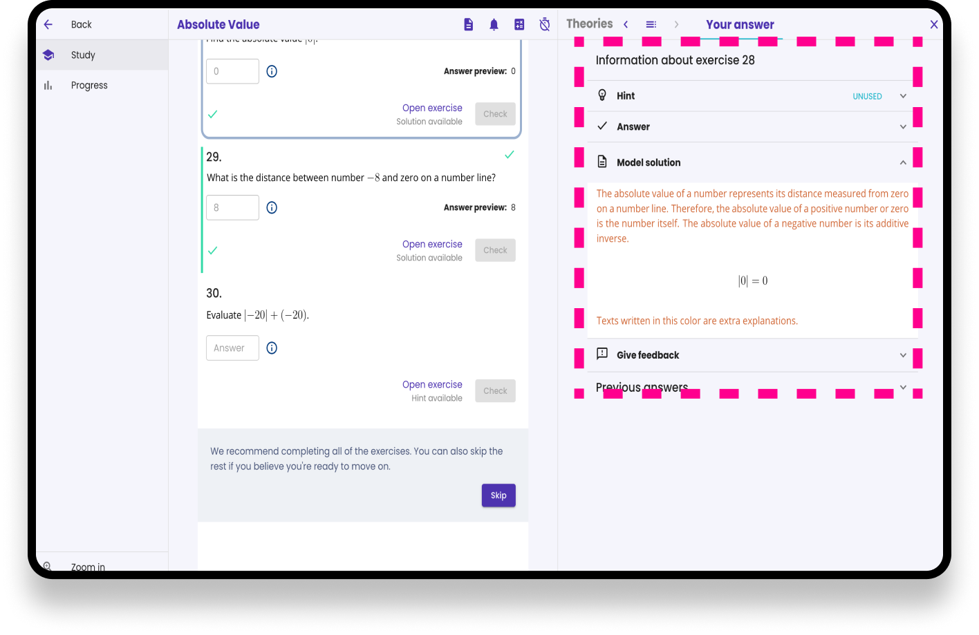
The previous UI used a two-column layout, but the interaction pattern lacked consistency. Clicking a question in the right-hand column opened it in the same column, while the model solution and hints appeared in the opposite column. This forced users to shift their attention between different areas of the interface, making the exercise flow feel fragmented and unintuitive.
The Solution: A Predictable, Self-Explanatory Flow
We redesigned the exercise flow to follow a logical top-to-bottom progression. Students answer the question first, and clear visual cues indicate that the model solution will appear directly below the answer field after submission. This makes the experience easier to understand without additional instructions.
Hints were moved to the Study Assistant panel, where they remain readily available without distracting from the primary task. This supports independent problem-solving while ensuring help is always within reach.
The Old Study UI
The New Study UI
Next Steps
Usability testing + Iterations: The first round of the designs were finished just before I stepped on parental leave so I wasn’t able to continue the project further. But we definitely wanted to test the new layout and flow with users and do editing based on that.
AI assistant: The company was very interested in using AI as an assistant for students. The idea was to add it to the Study Assistant UI element where users could e.g. chat with AI about the exercise.
Cleaning up the theories and materials: Each of the teachers had their own way of creating the theories and other materials. As many teachers, as many styles we had. I created the UI guidelines for the teachers and the development team built a tool where teachers can make the materials without thinking what type of fonts, spacing or colors they should use in the materials. With this solution we got more consistent UI that helped users to focus on studying and made the materials look as professional as the content in them was